Green and Pink Bedroom: Your Ultimate Style Sanctuary
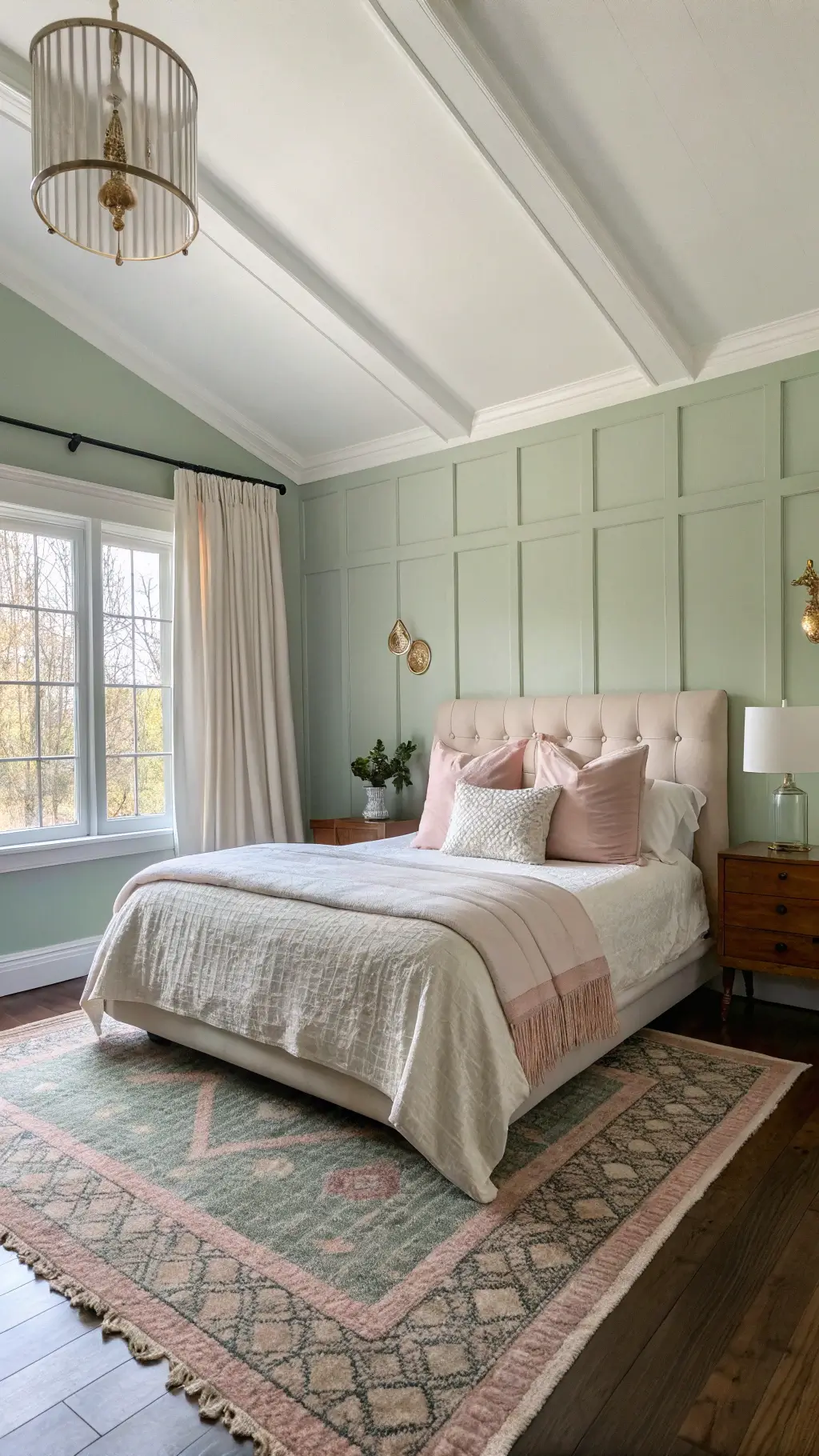
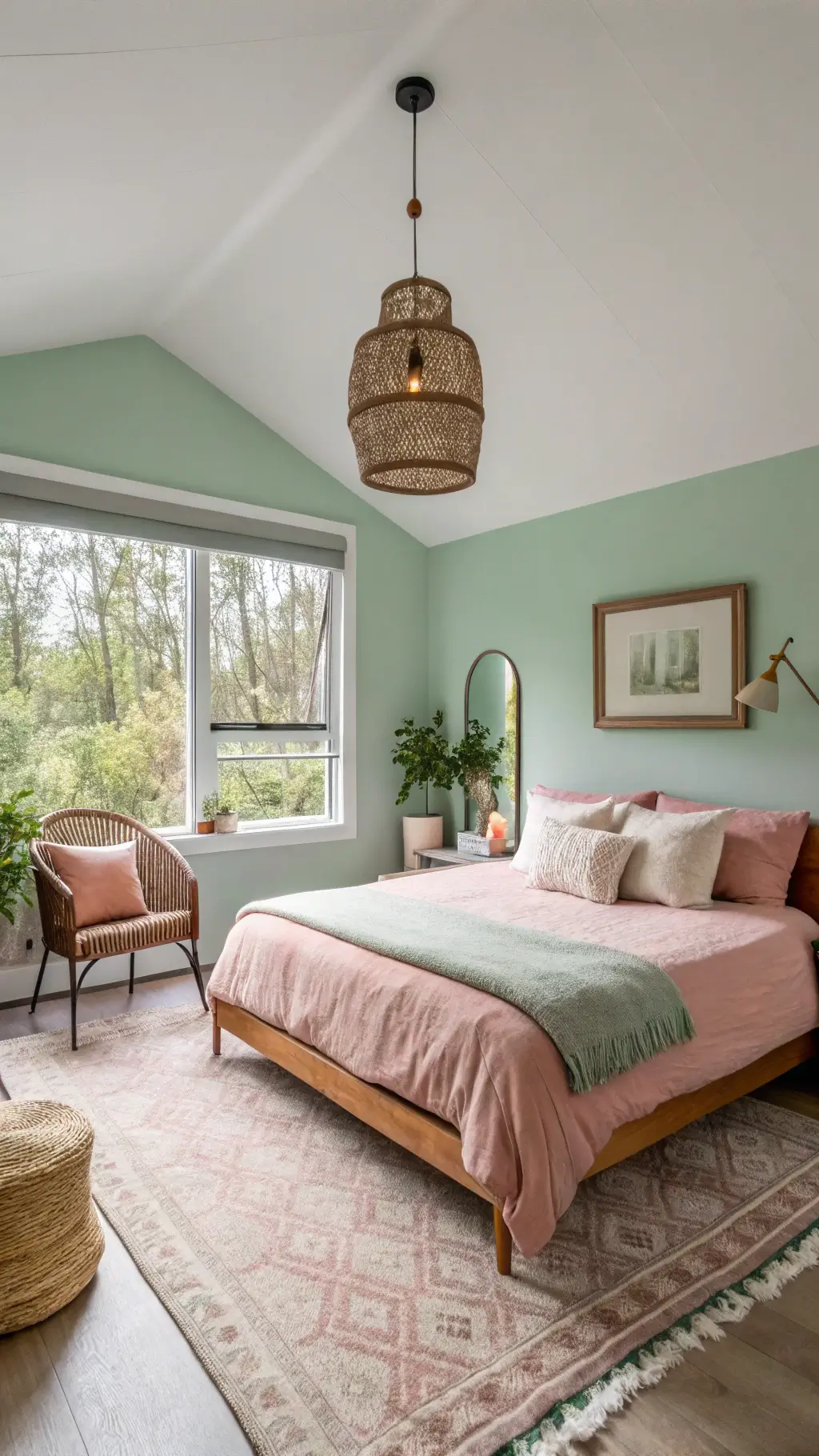
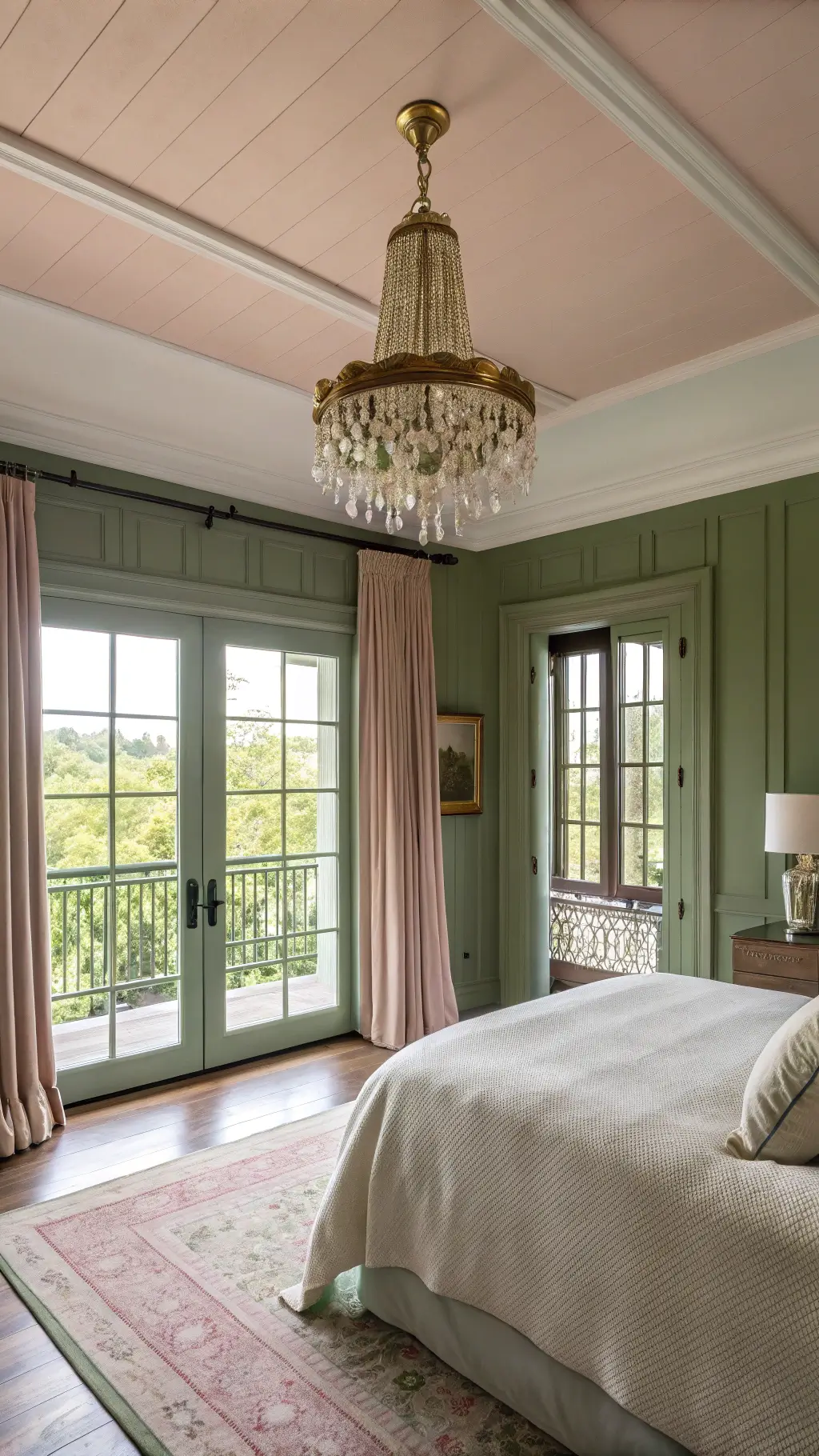
We did the bedroom green and pink with a sage wall and one dusty rose pillow, and it felt soft. A green and pink bedroom works when the pink stays muted so the green can lead.
💡 Steal This Look
- Paint Color: Sherwin-Williams Evergreen Fog SW 9130
- Furniture: Curved boucle headboard in cream, walnut nightstands with rounded edges, vintage-inspired brass bed frame
- Lighting: Scalloped ceramic table lamps in blush pink with brass bases, rattan pendant with warm glow
- Materials: Matte velvet upholstery, natural rattan, aged brass, raw linen bedding, terracotta accents
I’ve always found this pairing feels like walking through a garden at golden hour—there’s something deeply restorative about waking up surrounded by these tones. The key is treating pink as the accent your eye discovers, not the first thing it hits.
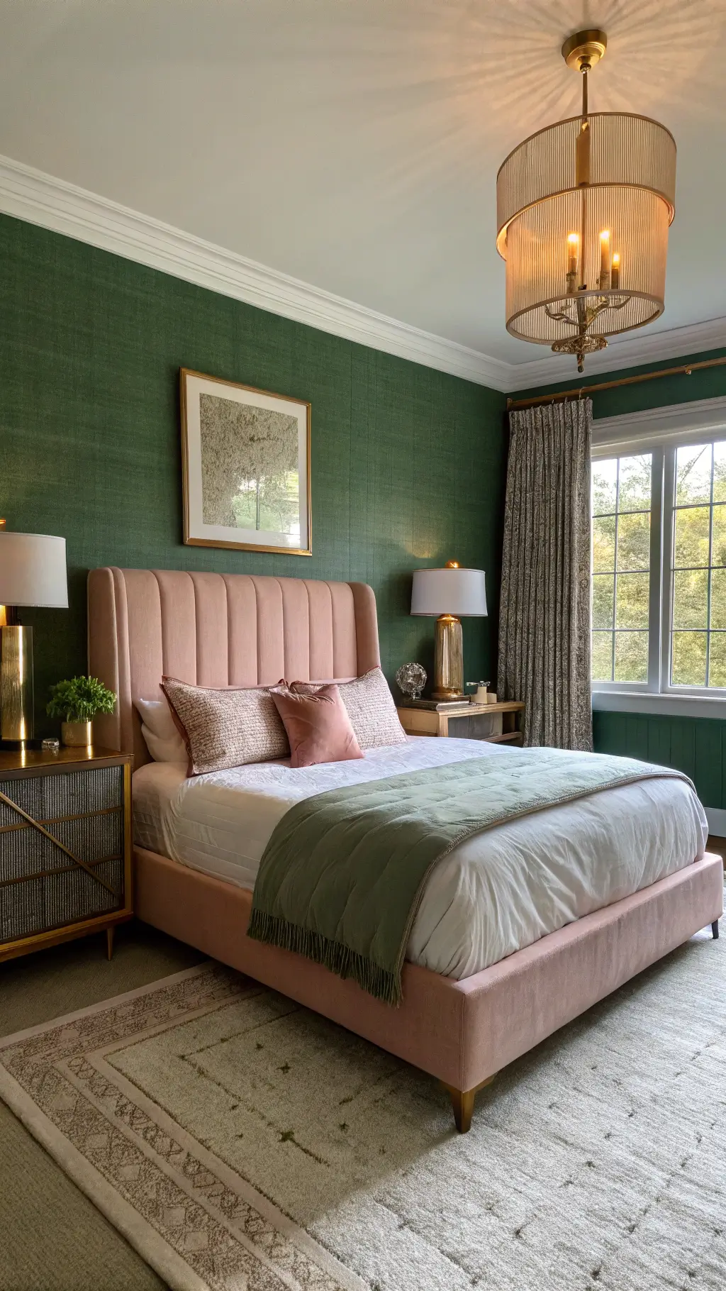
Why Green and Pink Work Magic in Bedrooms
Let’s cut to the chase. Green and pink aren’t just colors—they’re a mood, an experience. Here’s why they’re bedroom game-changers:
Color Psychology Breakdown
- Green represents growth, calm, and renewal
- Pink signals warmth, comfort, and emotional balance
- Together, they create a harmonious, living energy
★ Steal This Look
- Paint Color: Benjamin Moore Vintage Vogue 462 for sage green walls, Benjamin Moore First Light 2102-70 for soft blush ceiling or accent wall
- Furniture: upholstered linen platform bed in warm ivory, walnut nightstands with brass pulls, vintage-inspired velvet bench at foot of bed
- Lighting: brass adjustable wall sconces with linen shades flanking the bed, ceramic table lamp with terracotta base
- Materials: matte velvet, raw linen, aged brass, eucalyptus branches, terracotta, woven rattan
I’ve seen this combination transform sterile white boxes into sanctuaries that actually feel lived-in—the green grounds you when you wake, the pink softens the edges when you’re winding down. It’s the color equivalent of a deep breath.
Choosing Your Perfect Green and Pink Palette
Not all greens and pinks are created equal. Your perfect combo depends on your vibe:
Soft & Dreamy
- Sage green + blush pink
- Ideal for minimalist, calming spaces
- Perfect for relaxation and unwinding
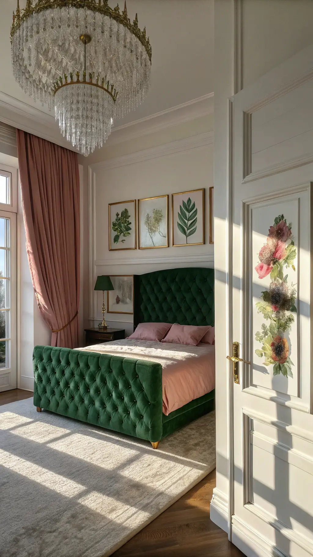
Bold & Dramatic
- Emerald green + deep pomegranate pink
- Creates a luxurious, statement-making environment
- Works brilliantly in modern or eclectic designs
✎ Steal This Look
- Paint Color: Farrow & Ball Green Smoke 47 (sage) and Farrow & Ball Pink Ground 202 (blush) for Soft & Dreamy; Farrow & Ball Bancha 298 (emerald-toned) and Farrow & Ball Radicchio 96 (deep pomegranate) for Bold & Dramatic
- Furniture: upholstered platform bed in natural linen for soft palette; velvet channel-tufted headboard in deep green for bold palette
- Lighting: brass globe pendant with frosted glass for soft spaces; sculptural black metal chandelier with pink glass accents for dramatic spaces
- Materials: washed cotton bedding, raw oak nightstands, and jute rugs for soft palette; lacquered furniture, marble surfaces, and brass hardware for bold palette
I’ve watched this palette transform from ‘nursery cliché’ to genuinely sophisticated—the trick is committing fully to one temperature family, either warm-leaning (olive with coral) or cool-leaning (sage with dusty rose), rather than mixing both.
Essential Design Elements
Must-Have Pieces
- Velvet headboard in emerald green
- Blush pink throw pillows
- Botanical wall art
- Textured area rug bridging both colors
Texture is Your Secret Weapon
- Mix velvet, linen, and silk
- Layer different fabric weights
- Create depth through varied textures
★ Steal This Look
- Paint Color: Behr Royal Orchard PPU11-01
- Furniture: Tufted velvet platform bed with channel-tufted headboard in deep emerald, paired with blush pink linen bench at foot of bed
- Lighting: Brass pharmacy-style wall sconces with linen shades flanking headboard
- Materials: Emerald velvet upholstery, blush linen textiles, warm brass metal accents, natural wood nightstands with cane detailing, botanical print paper
This is the bedroom palette I keep returning to when I need a space that feels both cocooning and quietly optimistic—there’s something about waking up surrounded by botanical tones that sets a gentler tone for the day.
Styling Like a Pro: Room Layout Tips
Balanced Color Distribution
- 60% neutral base (whites, grays)
- 30% green elements
- 10% pink accents
Pro Styling Tricks
- Use metallic accessories to break color intensity
- Incorporate natural elements like plants
- Play with pattern scales (small florals, large geometric prints)
✎ Steal This Look
- Paint Color: Valspar Ultra White 7006-24
- Furniture: Upholstered platform bed in soft gray linen, white nightstands with brass pulls, sage green velvet accent chair
- Lighting: Brass semi-flush mount ceiling fixture with frosted glass, paired with pink ceramic table lamps
- Materials: Linen bedding, velvet upholstery, brass metals, natural wood tones, ceramic accents
I always tell clients that the 60-30-10 rule feels restrictive until you see it in action—suddenly your eye travels calmly through the space instead of bouncing between competing colors.
Budget-Friendly Transformation Strategies
You don’t need a designer budget to create magic:
Quick, Affordable Updates
- Paint an accent wall
- Switch out bedding
- Add colorful throw pillows
- Introduce green plants
- Hang affordable botanical prints
✎ Steal This Look
- Paint Color: PPG Cloverleaf PPG1130-5
- Furniture: white metal bed frame with simple curved headboard, light oak nightstand with tapered legs
- Lighting: brass adjustable-arm wall sconce with white linen shade
- Materials: matte painted accent wall, cotton percale bedding in blush pink, woven rattan plant baskets, unframed pressed botanical prints on kraft paper
I always tell readers that green and pink bedrooms feel like sleeping inside a peony garden—there’s something inherently joyful about waking up surrounded by colors that refuse to take themselves too seriously.
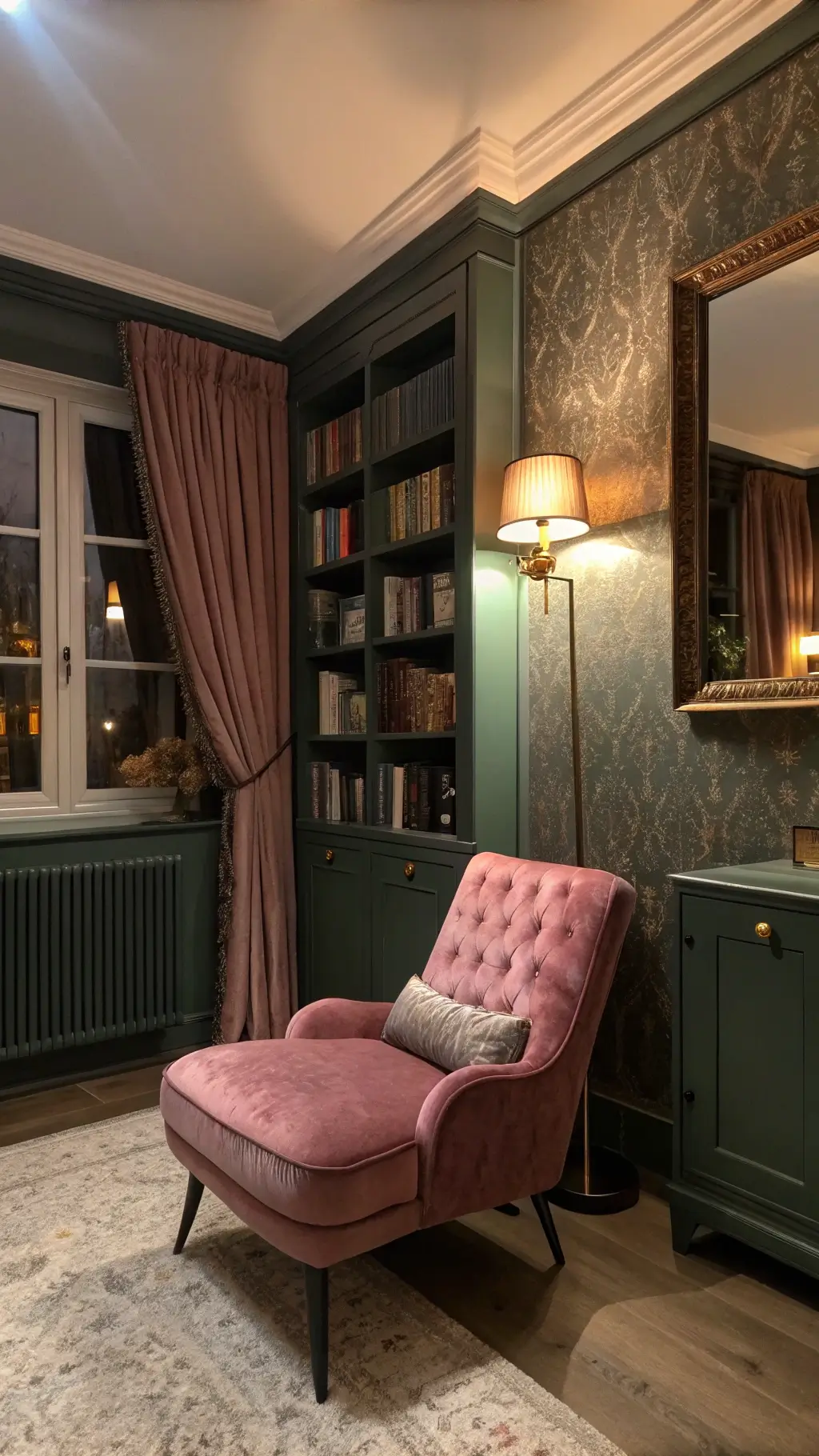
Common Mistakes to Avoid
Color Pitfalls
- Overwhelming the space with too much color
- Mismatched shade intensities
- Neglecting neutral balancing elements
🖼 Steal This Look
- Paint Color: Dunn-Edwards Softened Green DE5675 for walls, Dunn-Edwards Pink Quartz DE5002 for accents
- Furniture: upholstered platform bed in warm ivory linen, mid-century walnut nightstands, sage green velvet bench at foot of bed
- Lighting: brass adjustable wall sconces with linen shades flanking headboard, rattan pendant with warm glow
- Materials: raw linen bedding, unbleached cotton curtains, warm wood tones, natural jute rug, matte ceramic table lamps
I’ve seen too many green and pink bedrooms fail because someone fell in love with two bold swatches independently; the magic happens when you hold your paint chips and fabric samples together in the actual room’s light, stepping back to feel if they breathe together.
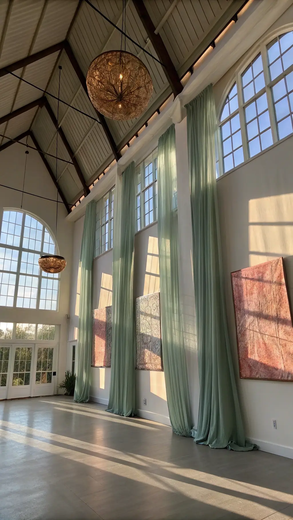
Seasonal Adaptation
Color Mood Shifts
- Spring/Summer: Lighter, pastel tones
- Autumn/Winter: Deeper, richer shades
- Swap accessories to keep the room feeling fresh
✎ Steal This Look
- Paint Color: Clare Paint Blush 0013 for spring/summer walls; Clare Paint Current Mood 0067 for autumn/winter accent wall
- Furniture: Upholstered platform bed in sage green velvet with removable blush linen slipcover for seasonal switching
- Lighting: Brass adjustable wall sconces with warm dimmable bulbs to shift from bright spring mornings to cozy winter evenings
- Materials: Linen and cotton bedding layers for warmer months; chunky wool throws and velvet cushions for colder seasons
I rotate my bedroom’s mood with the farmers market calendar—peony pink linens when the first blooms appear, then swapping in deep emerald velvet when the apples hit the stands. It keeps the space alive without a single paintbrush.
Photography & Social Media Sharing
Capture Your Space Like a Pro
- Use natural morning or late afternoon light
- Shoot from multiple angles
- Focus on texture and color transitions
- Use vertical formats for Pinterest
Final Thoughts
A green and pink bedroom works when the pink stays muted so the green can lead. A sage wall and one rose pillow keep it soft.