Monochromatic Home Decor: Transform Your Space with Single-Color Magic
Have you ever walked into a room and felt instantly calm, sophisticated, and perfectly put together? That’s the power of monochromatic home decor.
Monochromatic design isn’t about being boring—it’s about creating a harmonious, visually stunning space using clever color variations and strategic styling.

What Exactly is Monochromatic Decor?
Monochromatic home decor means decorating a room using different shades, tints, and tones of a single color. Think of it like painting with one color’s entire palette—from whisper-soft to rich, deep hues.
Why Monochromatic Works
Benefits of Single-Color Styling:
- Creates visual cohesion
- Makes spaces feel larger and more intentional
- Allows incredible design flexibility
- Works in ANY design style—modern, traditional, minimalist

Choosing Your Perfect Monochromatic Palette
Color Selection Strategies
Pro Tips for Selecting Your Base Color:
- Pick a color you genuinely love
- Consider room’s natural lighting
- Think about the mood you want to create
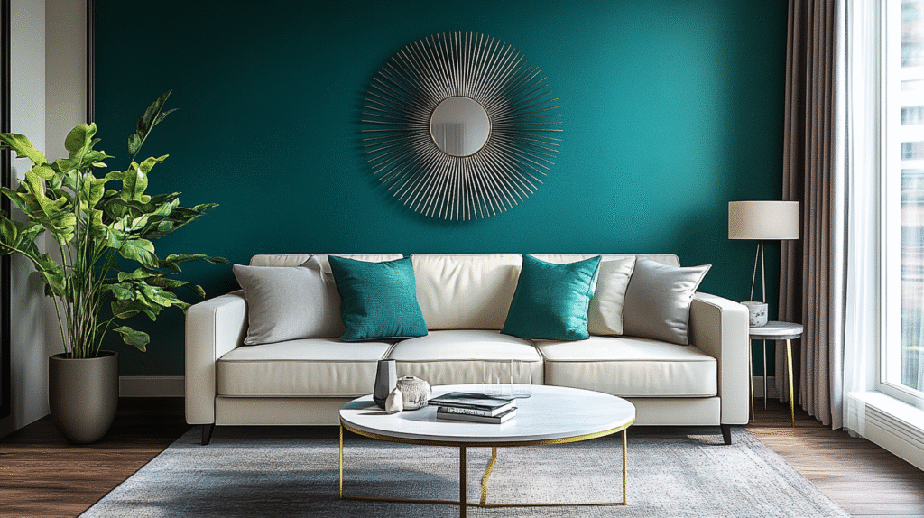
Popular Monochromatic Color Families:
- Serene Blues
- Warm Neutrals
- Crisp Whites
- Bold Black & White
- Earthy Greens
- Soft Grays

Texture: The Secret Weapon of Monochromatic Design
Since you’re working with one color, texture becomes your primary visual interest tool.
Texture Mixing Techniques:
- Combine matte and glossy finishes
- Layer different fabric weights
- Mix natural materials like wood, ceramic, and metal
- Use varied textile surfaces: velvet, linen, wool
Practical Texture Examples
- Smooth painted walls
- Chunky knit throw
- Sleek leather chair
- Rough woven rug

Accent Strategies for Monochromatic Rooms
Smart Accent Approaches:
- Introduce metallic finishes
- Use reflective surfaces like mirrors
- Add subtle pattern variations
- Incorporate organic elements like plants

Common Monochromatic Design Mistakes to Avoid
Pitfalls to Watch:
- Using zero texture
- Selecting too few color variations
- Creating an overly flat, lifeless space
- Ignoring balance and distribution

Pro Styling Techniques
How to Layer Like a Design Pro:
- Start with lightest shade for walls
- Use medium tones for large furniture
- Add darkest shades in accessories
- Distribute colors evenly
- Aim for 3-5 color variations

Real-World Monochromatic Palette Examples
Palette Inspirations:
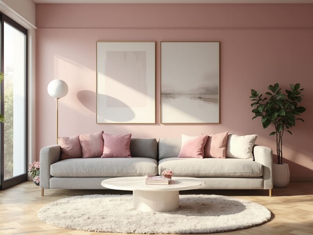
- Soft Blue-Gray Bedroom
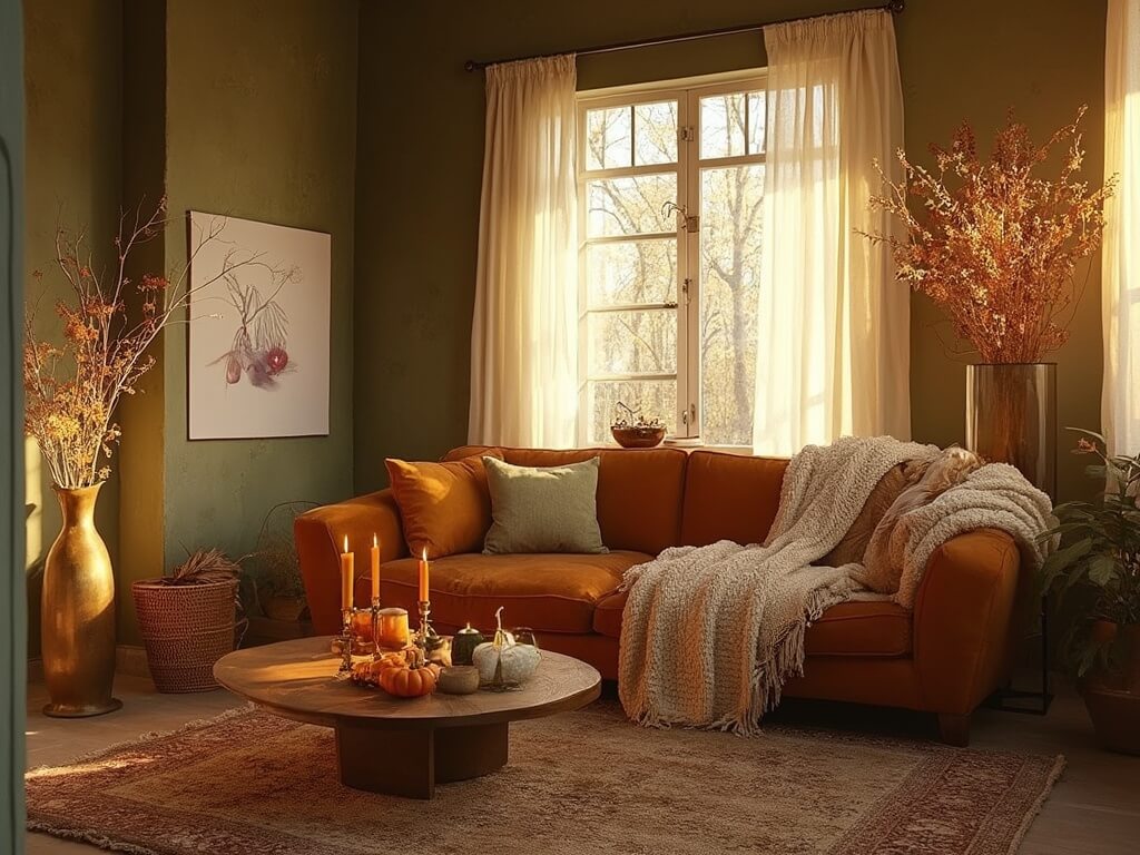
- Warm Caramel Living Room
- Crisp All-White Kitchen
- Dramatic Black & White Study
- Earthy Green Home Office
Final Design Thoughts
Monochromatic design isn’t about perfection—it’s about creating a space that feels intentional, calm, and uniquely yours.
Remember: Rules are guidelines. Trust your eye, have fun, and create a space that makes you feel amazing.
Pro Designer Secret: The most stunning monochromatic rooms tell a story through carefully curated textures and thoughtful color variations.