Coastal Style Decorating: A Real-World Guide to Getting the Look Without the Kitsch
The coastal style decorating I use is more restraint than theme. Light fabrics and one collected piece made the room feel like the shore, not a store.
Coastal style decorating gets a bad rap because most people picture rope-wrapped mason jars and driftwood signs that say “BEACH” in weathered letters. That’s not what I’m doing here, and it’s not what actually works in a real home you live in year-round.
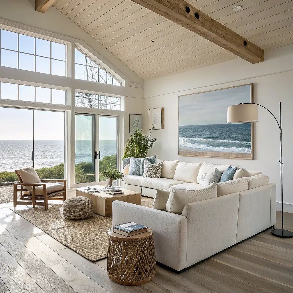
What I want is the feeling of a house two blocks from the water — light coming through linen curtains, a jute rug underfoot, a sofa you can nap on without ruining. Airy, quiet, uncluttered. That’s the version of coastal I’ve built in my own place over about three years of trial and error, and it’s what I’ll walk you through.
What Coastal Style Actually Is (and Who It’s For)
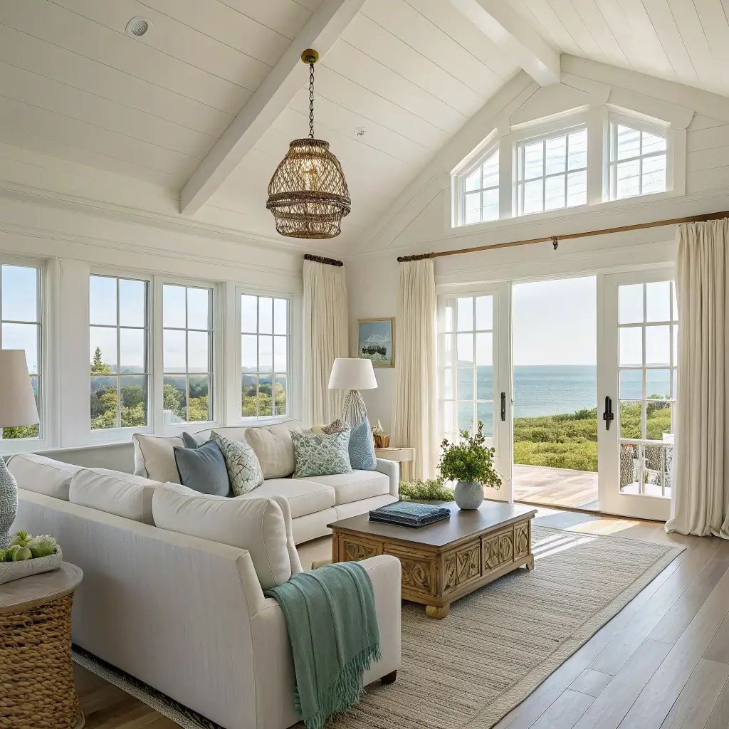
Strip away the theming and coastal style is really about three things: natural light, natural materials, and a restrained palette pulled from sand, water, and sky. That’s it. Everything else is variation.
The current umbrella covers a few flavors:
– Modern coastal — cleaner lines, less pattern, more architectural
– Coastal chic — a touch more polish, some brass, occasional blue-and-white porcelain
– Coastal grandma — softer, slipcovered, a little more pattern and hydrangea energy
You don’t have to pick one. My living room leans modern coastal; my bedroom is fully coastal grandma with a ruffled linen duvet I bought against my better judgment and now can’t imagine sleeping without.
This style is for you if you want a calm, casual house that mixes well with Scandinavian, farmhouse, or a little boho. It’s not for you if you love saturated color, glossy lacquer, or heavy traditional furniture.
Where it works best: living rooms and open kitchen/dining areas get the most out of it because they have the light and the sightlines. Bedrooms are easy. Bathrooms are where people go wrong — a subtle tile and a linen shower curtain, done. No starfish soap dishes.
Time, Cost, and Skill Level
A single-room refresh takes one weekend. I did my living room in about eight hours: paint touch-ups Saturday morning, furniture shuffle after lunch, styling Sunday. If you’re painting whole walls or swapping big furniture, budget two to four weekends for a full apartment.
Rough cost brackets I’ve actually spent or seen work:
– Budget refresh with existing furniture: $300–$1,000. Linen pillow covers ($20–$60 each), a jute 5×7 rug ($80–$250), a few rattan baskets ($25–$80), one or two coastal prints ($40–$200).
– Midrange living room redo: $3,000–$8,000. Slipcovered sofa ($900–$2,500), rattan or cane accent chair ($250–$900), 8×10 natural fiber rug ($250–$700), a rattan pendant and a glass lamp or two.
– High-end: $10,000–$30,000+ across multiple rooms. Custom sisal, designer slipcovered sectional, original artwork.
Skill level is beginner to intermediate. Anyone can swap textiles and style a coffee table. Painting walls and hanging a heavier pendant is intermediate. Nothing here needs a contractor.
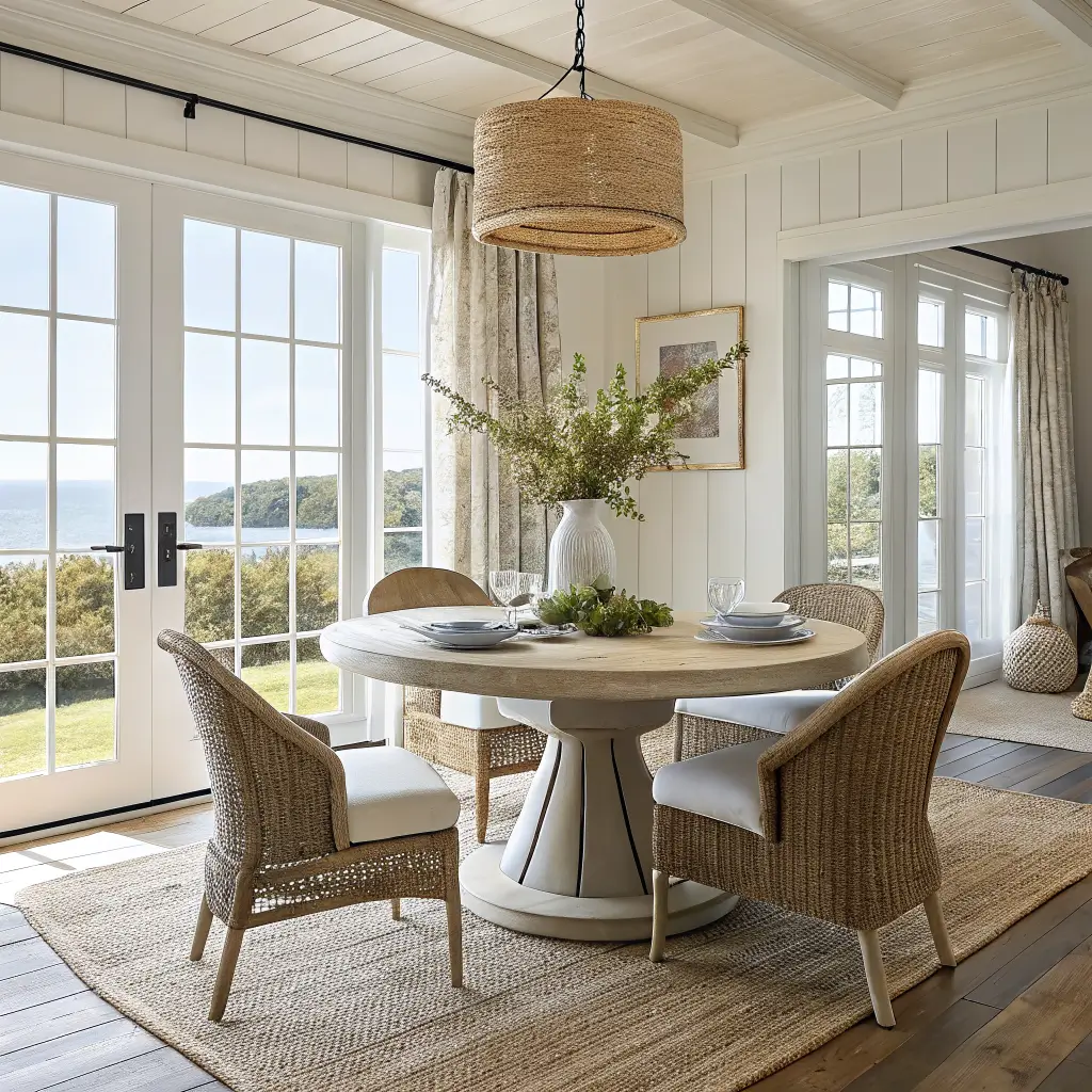
The Color Palette I Actually Use
Coastal lives or dies on the palette. Get this right and half the work is done.
Walls and base (70–80% of what you see):
– Chalky whites: Benjamin Moore Chantilly Lace or Swiss Coffee by Dunn-Edwards
– Warm off-whites and sandy beiges for something less stark
– Light stone grays if your light is very warm and needs balancing
I painted my living room Chantilly Lace after two failed attempts with cooler whites that read blue in afternoon light. It’s the one I always come back to.
Accents (20–30%):
– Soft blues — seafoam, powder, duck egg
– Deeper blues — navy, indigo, slate — used sparingly
– Soft greens — sage, celadon, dune grass
– Small pops of coral or a warm yellow if you want Palm Beach energy
Rule of thumb: pick two accent colors and repeat them. Mine are duck egg blue and sage. They show up in pillows, a runner, the art over my sofa, and a ceramic vase. That’s it. The repetition is what makes it feel intentional instead of scattered.
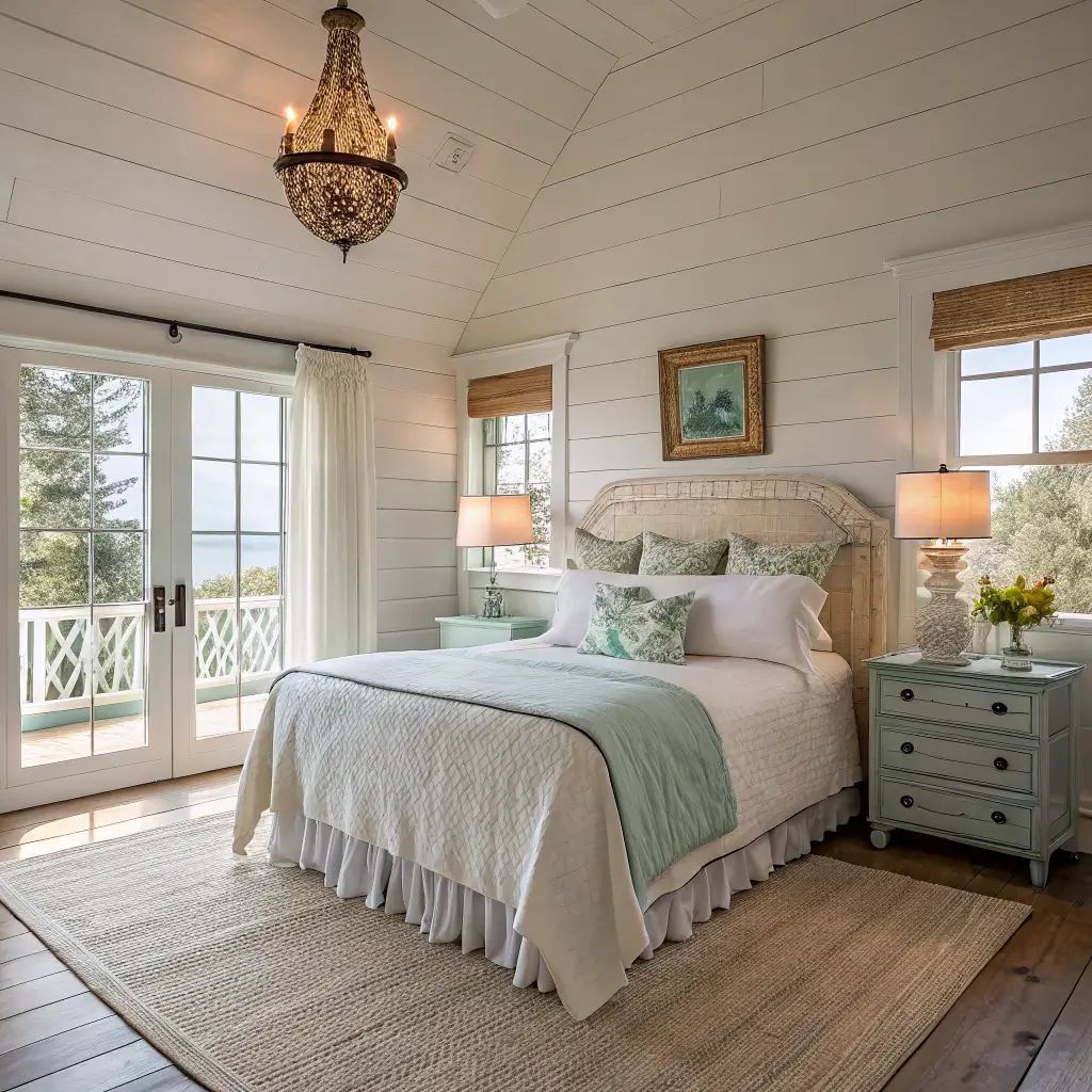
The Materials That Do the Heavy Lifting
If your palette is right and your materials are right, you almost can’t mess this up.
– Fibers: linen, cotton, jute, sisal, seagrass, rattan, wicker
– Woods: bleached oak, whitewashed pine, driftwood, weathered reclaimed
– Hard surfaces: matte plaster, unpolished stone, light ceramics
– Metals: brushed brass, bronze, or polished nickel — small doses, for warmth
– Glass: clear or sea-glass toned, to bounce light
Skip anything glossy, high-shine, or heavily lacquered. Coastal is matte and touchable.
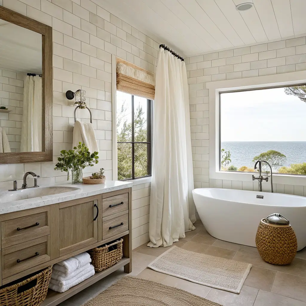
Hero Pieces: Where to Spend
Three things determine whether a room reads coastal or reads like a mishmash.
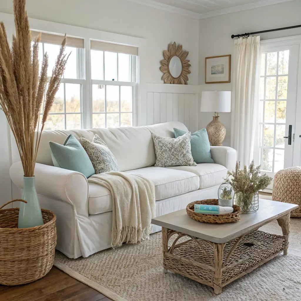
1. A slipcovered sofa in white, cream, or oatmeal. Performance linen or cotton, individual cushion covers so it looks tailored, not saggy. This is the anchor. If you can only afford one big purchase, this is it. I have an IKEA Söderhamn with a Bemz slipcover in Belgian linen — total was around $1,800 — and it’s held up through a dog, red wine, and one memorable pasta incident.
2. A natural fiber rug. Jute, sisal, or seagrass. Get it big enough that the front legs of your sofa and chairs sit on it — at minimum. In a 12×16 living room, that’s usually an 8×10. A too-small rug is the single most common mistake I see, and it makes the whole room look off without people knowing why.
3. One piece of large-scale coastal art. Not a gallery wall. One thing, at least 24″x36″, ideally bigger over a sofa. An abstract ocean, a moody sea photograph, an oversized botanical. My current favorite is a $65 print of a foggy Maine coastline I bought on Etsy and had framed at Michaels — the frame cost more than the print, which is usually how it goes.
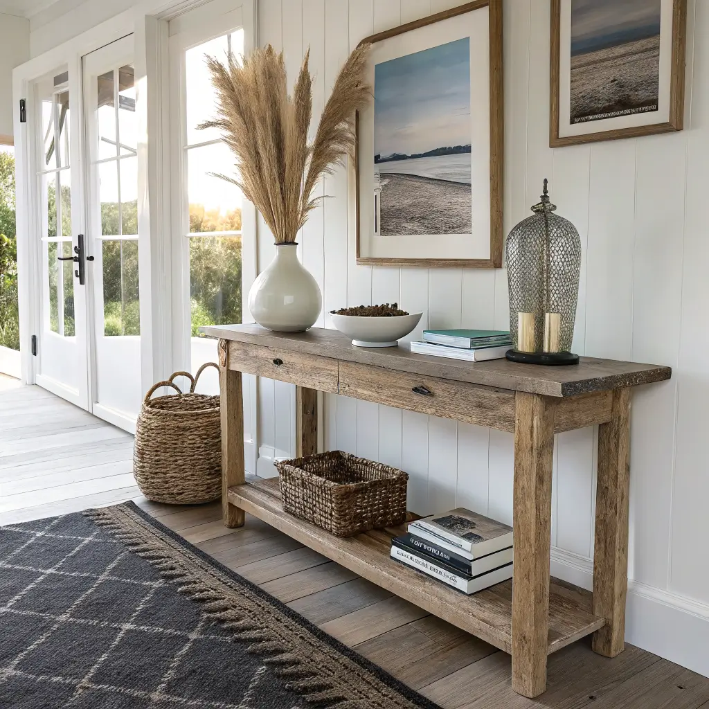
Where to Save
– Pillows and throws — HomeGoods, Target Threshold, and IKEA are fine
– Baskets — thrift stores are full of them
– Vases and ceramics — same
– Curtains — IKEA’s Aina and Merete panels look expensive for what they cost
I bought a giant seagrass basket at a Goodwill in Rhode Island for $6 that I now use for extra blankets. It’s better than anything I’ve seen at West Elm.
Lighting
Overhead light alone will kill this style. You need layers.
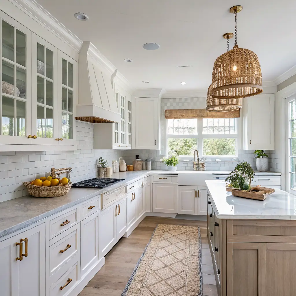
– One overhead fixture — rattan pendant or a linen drum shade
– Two table lamps minimum in a living room — glass base with a linen shade is the safest bet
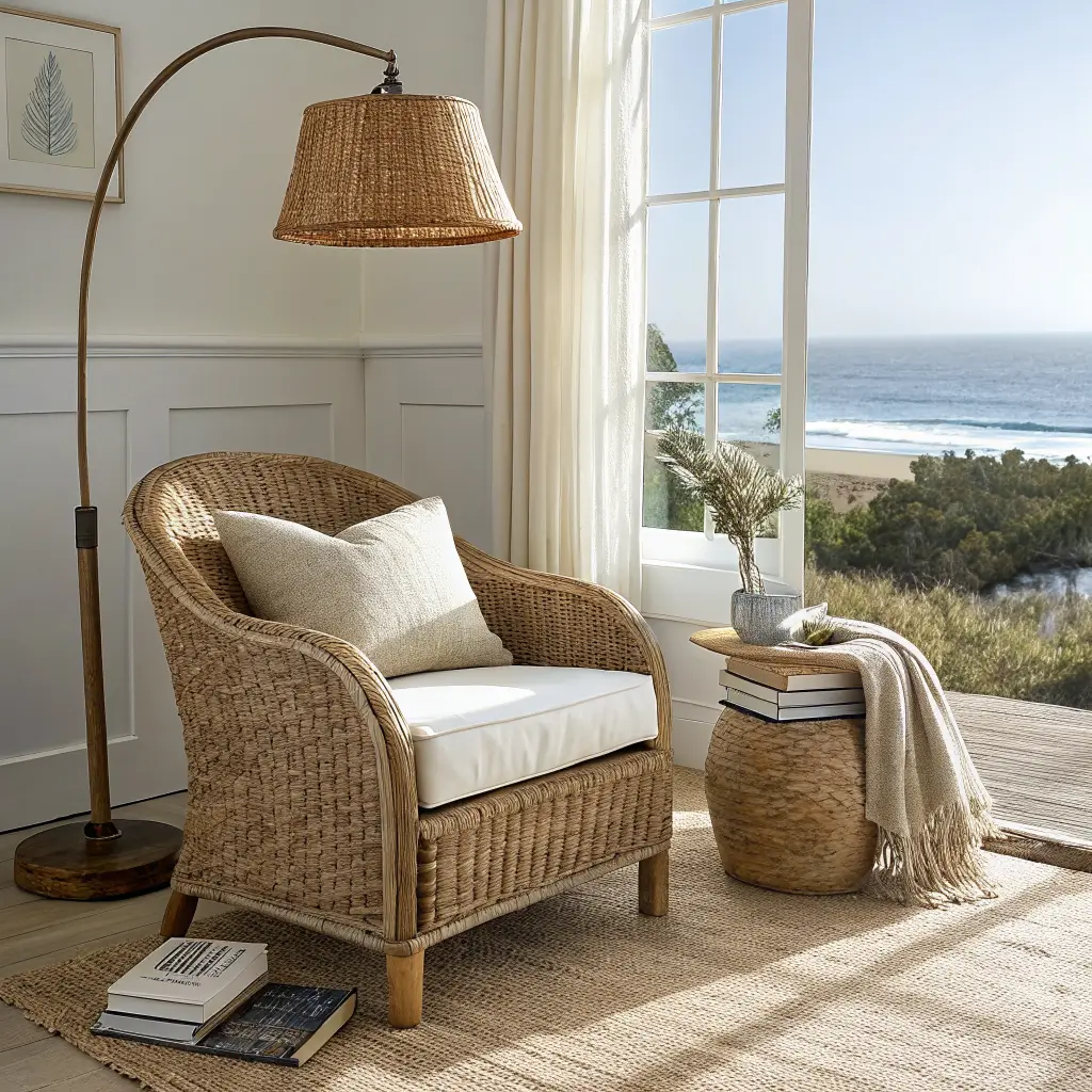
– A floor lamp in the darker corner, ideally with a woven or paper shade
Warm bulbs only. 2700K, never higher. Daylight bulbs make coastal rooms look like a dentist’s office.
How to Actually Put It Together
Order matters. If you try to style before the foundation is set, you’ll rearrange forever.
1. Rug down first. Everything else keys off it.
2. Sofa and main seating on the rug, oriented toward the window or fireplace, not the TV if you can help it.
3. Coffee table and side tables — leggy, open bases, roughly 18″ from the seat.
4. Curtains hung wide and high. This is the single cheapest upgrade in decorating. Mount the rod 4–6 inches above the window frame and extend it 8–12 inches past each side. Your windows will look twice as big.
5. Lighting in place — plug everything in and test at 7pm before you commit.
6. Art last, then accessories.
Styling: Big, Few, Intentional
The mistake I made for years was scattering small things everywhere. A shell here, a candle there, three tiny frames on a shelf. It looked like a cluttered gift shop.
Fix: fewer, larger pieces. One big ceramic vase instead of five little ones. One stack of three books with a piece of coral on top instead of a dozen trinkets. One bowl of sea glass, not sea glass on every surface.
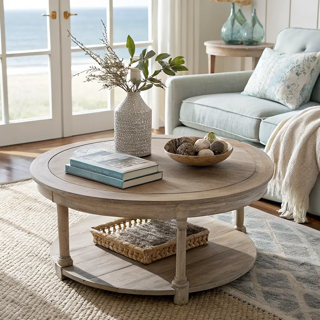
For coffee tables, I use the rule of three: a small stack of books, one sculptural object (a piece of driftwood or a low ceramic bowl), and something green or fresh (a sprig of eucalyptus in a bud vase counts).
Limit obvious beach motifs to one or two pieces per room. A single vintage oar over a bench is charming. An oar, a ship wheel, a rope-wrapped lamp, and a “Life’s a Beach” pillow is a theme park.
The Five Mistakes I See Constantly
Too literal. Sailboats, anchors, rope everywhere. Fix: trade motifs for materials. Rattan and linen say coastal without a single anchor.
Blue overload. Blue walls, blue sofa, blue rug, blue art. It goes cold fast. Keep blue in textiles and art; keep walls and big furniture neutral.
Too cold. All white and gray, no wood, no woven, no warmth. Fix: bring in oak, jute, brass, and something in a camel or sand tone. Warmth is what separates coastal from clinical.
Cluttered surfaces. Edit ruthlessly. If you can’t remember what’s on your console without looking, there’s too much on it.
Heavy curtains. If your drapes are blocking your light, they’re working against everything else you’re doing. Sheer linen, roller shades, or nothing at all if privacy isn’t an issue.
Seasonal Swaps Without Redoing Everything
The base stays; the accents shift.
– Summer: more blues, striped pillow covers, a bowl of shells collected from an actual beach if you have one
– Fall/winter: swap in a chunky cream or camel throw, a rust-colored pillow, a wool runner. Add dried grasses or branches instead of fresh florals.
– Holidays: cedar garland, white lights, glass ornaments. Skip the red or use it in one small dose — a single wreath, not everywhere.
I keep two bins in my closet — “warm months” and “cool months” — with pillow covers and throws in each. Ten-minute swap, room feels completely different.
Keeping It Coherent Across the House
Pick your core palette once and hold the line. Mine is Chantilly Lace walls, oak and rattan wood tones, duck egg and sage accents, brass hardware. Every room follows that formula with small variations. My bedroom has more linen and a slightly softer blue; my entry has a heavier jute rug and darker baskets. But it all reads as one house.
Every few months I walk through and pull anything that’s drifted off-palette — a bright fake plant someone gave me, a picture frame in the wrong wood tone — and either rehome it or replace it. That ongoing edit is what makes the difference between a home that looks styled and one that looks like it’s slowly reverting to chaos.
The best coastal rooms I’ve been in feel like the owner spent a lot of time thinking about what to leave out. That’s the real move. Less stuff, better stuff, and enough light to see it by.