The Look and Who It’s For
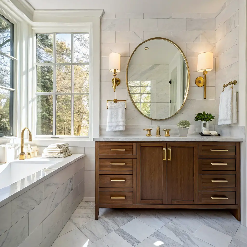
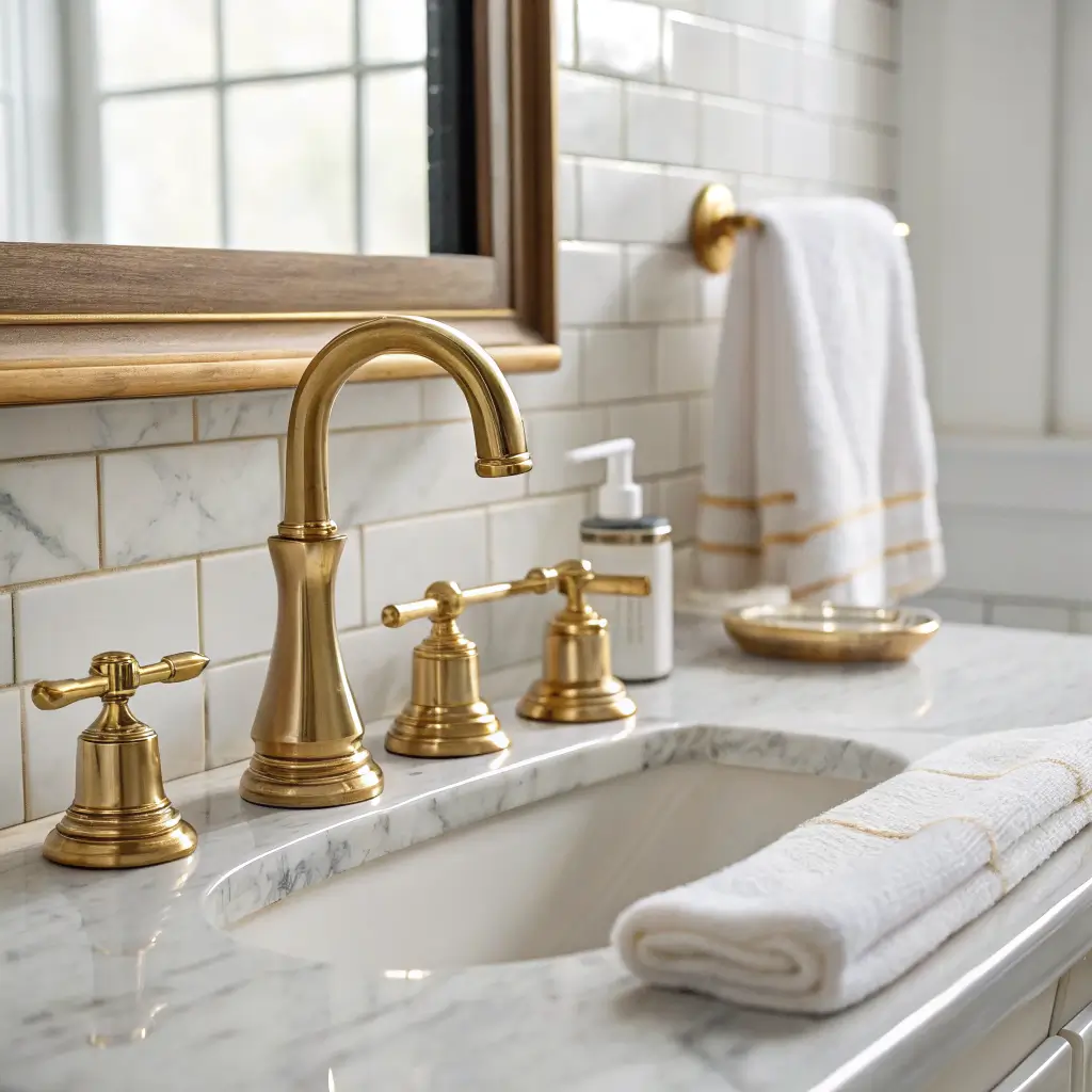
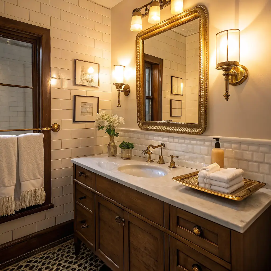
The gold bathroom decor was the risk I took with one faucet and a mirror frame. The warm metal made the small room feel intentional, not flashy.
This style sits somewhere between
It’s for you if:
– Your bathroom feels cold, builder-grade, or generic
– You want it to feel more expensive without ripping out tile
– You’re renting and can only swap accessories, mirrors, and maybe hardware
– You already have marble, white tile, black tile, or a wood vanity and want to make it feel intentional
It works in tiny powder rooms and standard family bathrooms. Small spaces actually benefit more from gold because a single well-placed piece reads as a focal point instead of clutter.
Time and Money: What You’re Actually Signing Up For
–
–
–
Skill level tracks with cost. Accessories and mirror hooks are beginner. Swapping a faucet or wiring a sconce is intermediate (turn the water/power off — I learned this the wet way). Retiling or replacing shower valves is call-a-pro territory.
The Pieces That Actually Make It Work
Not everything needs to be gold. That’s the mistake people make. You want a few strong touchpoints, not a themed room.
–
–
– Towel ring or towel bar
– Toilet paper holder
– Wall sconces or a vanity light bar
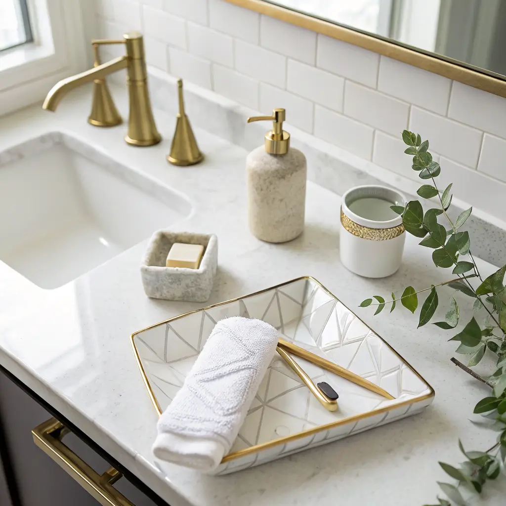
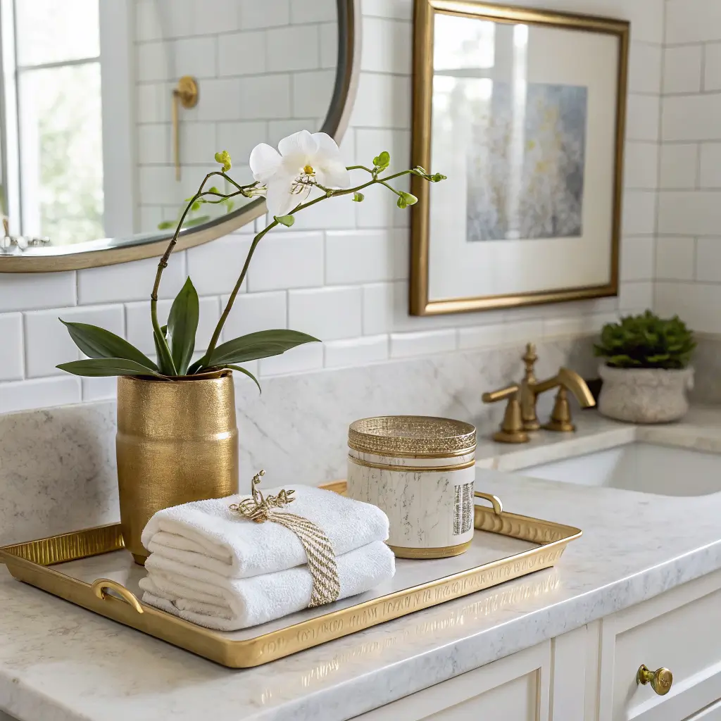
– Soap dispenser or a small tray on the counter
– Gold-vein marble tile in a shower niche
– A wallpaper with a subtle gold pattern in a powder room
– Backlit mirror with a brass frame — the halo effect makes the metal glow
The rule I use:
How to Put It Together
Pick one gold finish and commit
This is where most people go wrong. Brushed brass, matte gold, polished gold, and rose gold do not mix well. They read as mismatched, not eclectic.
My preference for bathrooms:
Rose gold is its own thing. Warmer, pinker, softer. Beautiful, but treat it as a separate palette — pair it with deeper moody colors (burgundy, plum, charcoal), not the same cool whites where brass sings.
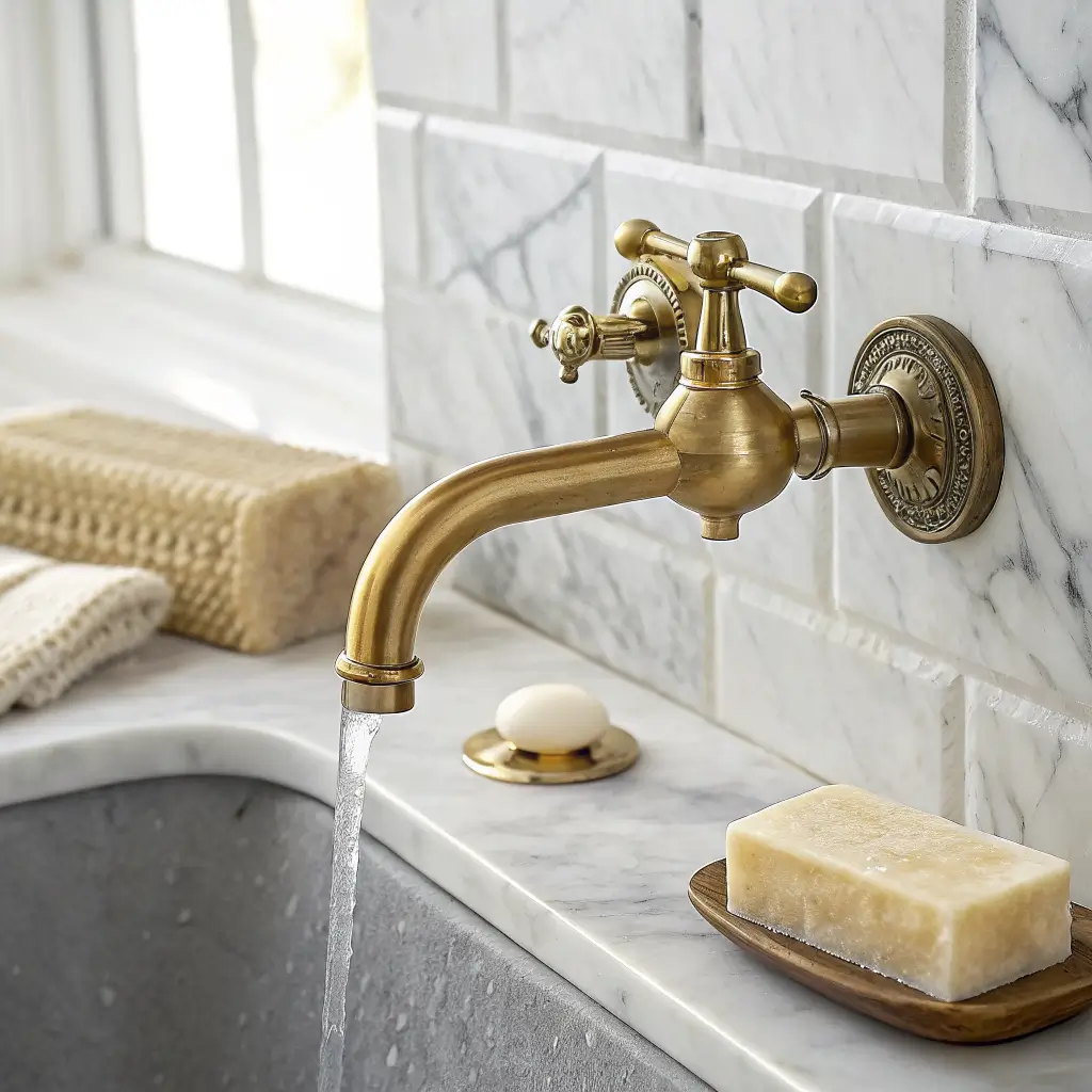
Get the background right
Gold behaves like jewelry. It needs a plain backdrop or it competes with itself.
– White subway tile or white walls
– Carrara or any white-and-gray marble
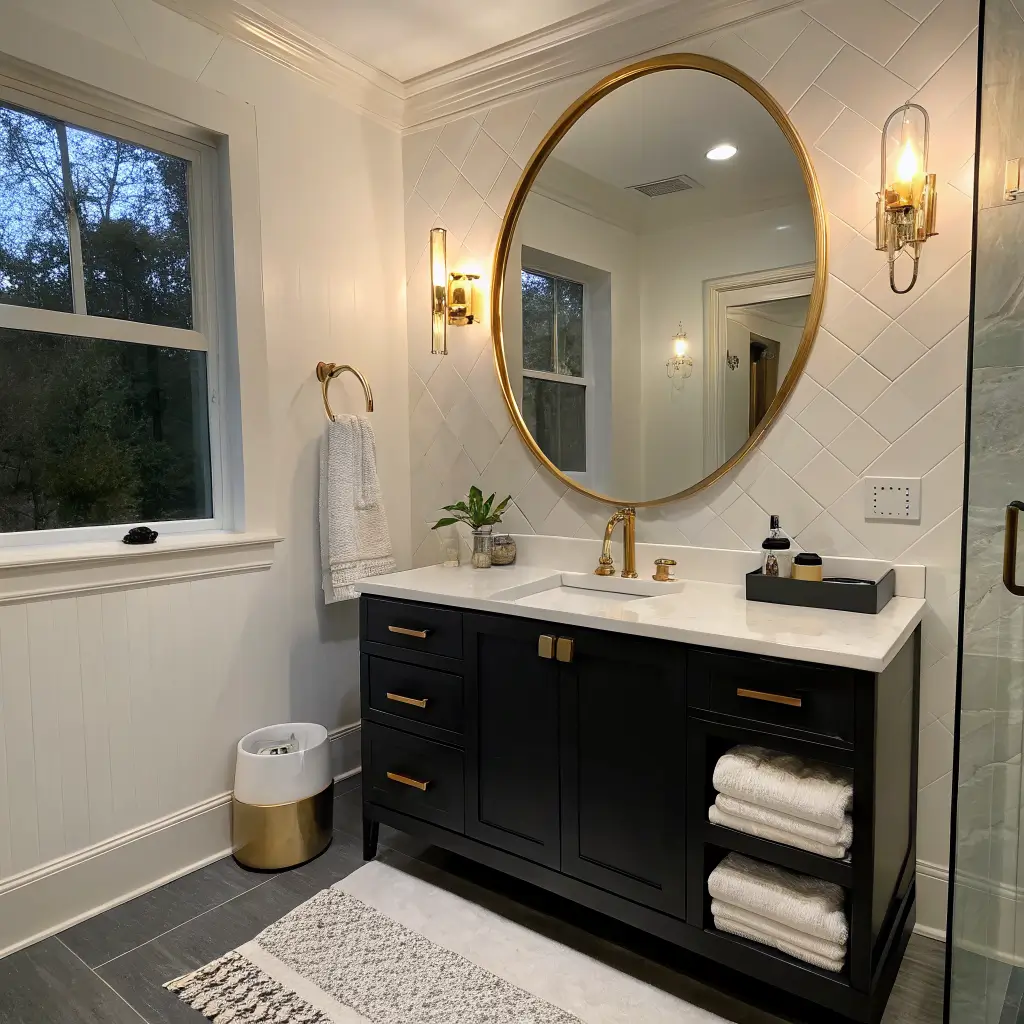
– Matte black tile or a black vanity
– Deep navy or forest green painted walls
– Warm wood vanity fronts (walnut, oak)
– Busy patterned tile in warm tones
– Beige-on-beige-on-beige
– Yellow-tinged whites (they make brass look dingy)
The first bathroom I did, I put brushed brass hardware against a cream-and-tan tile I already had. It looked cheap. Same hardware, six months later, against fresh white paint and a black-framed shower door — completely different room.
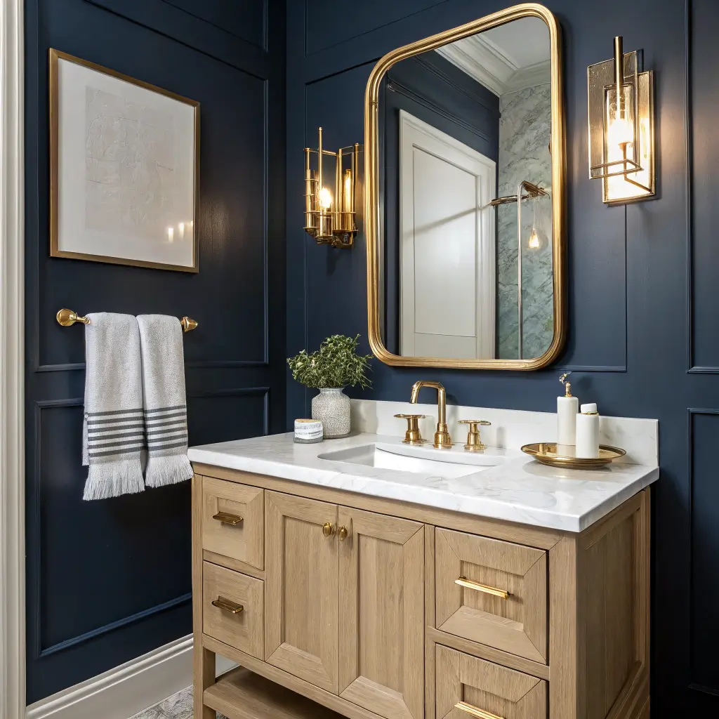
Build in layers, at different heights
Place gold at the mirror, at the faucet, on a wall sconce, and on the counter. That vertical spread is what makes it feel designed instead of accidental. If all your gold sits on the counter, the eye has nowhere to travel.
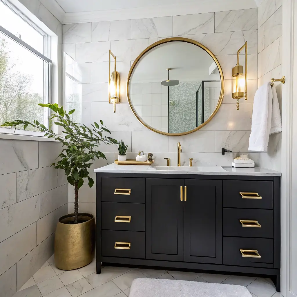
High-contrast vs. soft-luxe — pick your mood
–
–
–
–
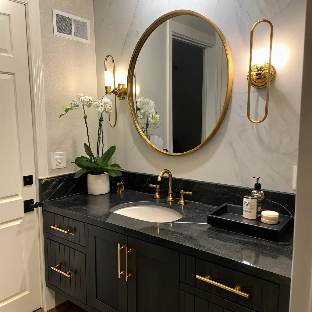
Where to Spend and Where to Save
Mistakes I’ve Made (So You Don’t Have To)
–
–
–
–
–
Easy Updates and Seasonal Tweaks
Once the bones are set, the room barely needs to change. But a few low-effort refreshes:
– Swap in
–
– A
–
– Rotate a
For a full seasonal shift without spending money, just swap textiles: bath mat, towels, and shower curtain. Keep the metal consistent and everything else can flex.
Common Questions
White and black are the safest. Navy, emerald, and forest green look richest. Avoid yellow-adjacent creams — they clash with brass undertones.
Close but not identical. Brushed brass has a slightly warmer, more muted, sometimes greenish-gold cast. “Gold” finishes are often more yellow. Both read as gold in a bathroom context, but they don’t always match each other — check finishes in person before mixing brands.
Three things: buy PVD-coated fixtures, use brushed (not shiny plated) finishes on the budget accessories, and keep the background simple. Cheap gold looks cheap mostly because it’s surrounded by too much stuff.
Yes, and it’s one of the best combinations you can pick. Black vanity, black shower frame, or matte black tile with brushed brass hardware — that’s a hotel-bathroom formula.
Yes, but it’s its own lane. Treat it as a separate palette rather than a swap for regular gold. It looks best with deeper, moodier colors — burgundy, dusty plum, charcoal — not the crisp whites where brass shines.
Wall sconces flanking the mirror at roughly eye level (about 60–66″ from the floor, center of fixture). Overhead-only lighting casts shadows on your face and makes gold look flat. Two sconces plus a warm overhead is the sweet spot.
Get the faucet, the mirror, and the light bulbs right, and the rest of a gold bathroom mostly falls into place on its own.