The coastal boho mix is the look I landed on after too many themed rooms. Whitewashed wood and one jute rug did the work a sign never could.
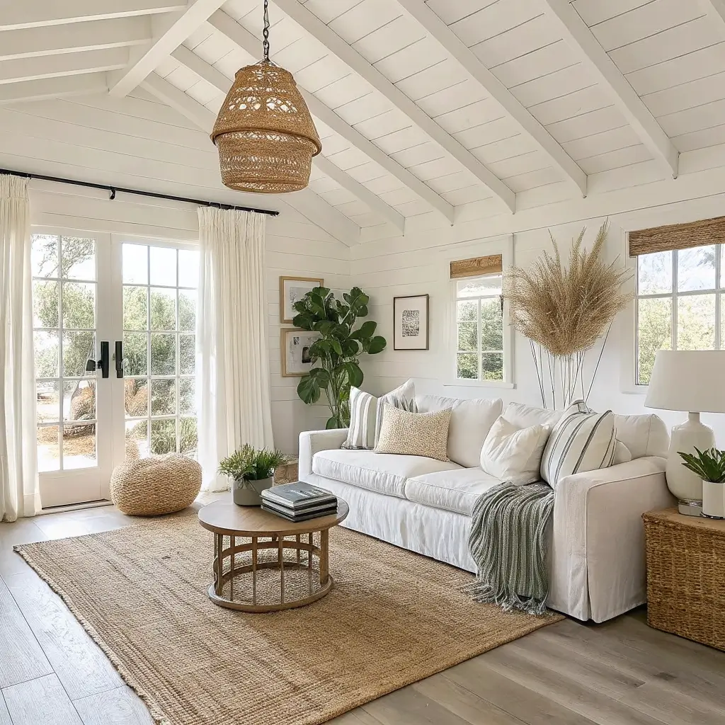
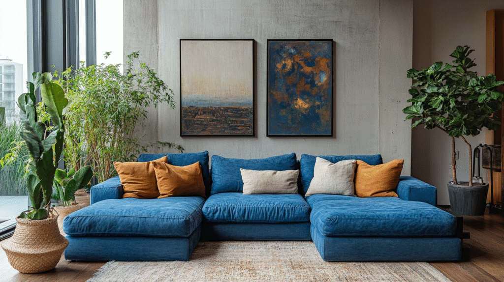
Think of a linen-slipcovered sofa, a jute rug underfoot, a rattan pendant overhead, one big piece of moody ocean art, and a fiddle-leaf fig in a woven basket. That’s the shorthand. Light neutrals do the heavy lifting, natural fibers add warmth, and a few handmade or ocean-inspired pieces give it soul.
It suits you if:
– You want a calm, beachy feeling without literal seashells on every surface
– You like plants, handmade ceramics, linen, and travel-collected pieces
– You prefer a restrained palette but rich texture
– You’re drawn to Australian coastal, California casual, or Mediterranean interiors
It works in small apartments (250–500 sq ft living areas) because the light palette keeps things open, and it sings in bedrooms (120–200 sq ft) and living rooms (180–350 sq ft) where you have room to layer without crowding.
Time and Money: What You’re Actually Signing Up For
A one-room refresh (rearranging, hanging art, swapping textiles, adding plants) takes me 4–8 hours if the pieces are already bought. A full makeover with painting and new furniture is a solid weekend, 10–16 hours.
Cost bands, based on what I’ve actually spent and shopped:
– Budget refresh, $250–$700: jute rug 5’×8′ ($80–$200), rattan pendant ($70–$180), linen throw pillows ($25–$60 each), a macramé wall hanging ($30–$90)
– Mid-range makeover, $1,200–$3,000: light wood or rattan bed frame or sofa ($500–$1,200), woven accent chair ($150–$400), a big indoor plant with basket ($60–$150)
– Relaxed-luxury version, $3,000–$8,000+: designer linen sofa ($2,000–$4,000), custom oversized art at 48″×72″ ($600–$1,500), and a mix of high-quality rugs and artisan pieces
Skill level: beginner to intermediate. Styling pillows and hanging lightweight art is beginner territory. Installing a ceiling pendant, whitewashing a piece of wood furniture, or limewashing a wall bumps it up a notch.
Season: year-round. It leans summery by default but takes well to autumn/winter with heavier throws and terracotta accents.
The Palette I Actually Use
Two things saved my room from looking bland: sticking to a small palette, and letting texture do the work color usually does.
My four-color rule, roughly what the pros are pulling for 2025–2026 too:
– Cloudy white on walls (something like Benjamin Moore Cloud Dancer or Simply White in an eggshell finish)
– Sand and driftwood neutrals — beige, taupe, warm mushroom
– Soft sage or muted seafoam for a hint of coastal color
– Sun-baked clay or soft terracotta for warmth so it doesn’t read cold
I add small hits of dark contrast — a black picture frame, a walnut side table — so the room doesn’t wash out. That was the fix for my first version, which looked like a hotel lobby that forgot to finish.
Materials that matter most: jute, sisal, cotton, linen, hemp, rattan, cane, bamboo, wicker, light oak or ash, driftwood finishes, seagrass, and handmade ceramics.
Hero Pieces: What to Actually Buy First
You don’t need everything at once. Buy the anchors, live with them, then layer.
The anchors:
– Light neutral sofa or bed frame. A linen or cotton slipcover sofa in white, cream, or sand, 80″–90″ wide for a 3-seat. For the bedroom, a light wood or rattan queen frame (60″×80″) — a woven headboard is the single fastest way to signal this style.
– Jute or sisal rug. 5’×8′ for a small living room, 8’×10′ for a proper one. Natural sand tone. Warning from experience: jute sheds like a golden retriever for the first month. Vacuum, don’t panic.
– One woven accent chair. Rattan lounge or cane chair, 24″–30″ wide, with a cushioned seat so people will actually sit in it.
– Statement lighting. An oversized rattan or wicker pendant, 16″–24″ in diameter, over the dining table or living area. Table lamps with ceramic bases and linen shades on side tables.
The complementary layer:
– Linen and cotton throw pillows with subtle patterns — thin stripes, small block prints — in white, sand, sage, soft blue
– Lightweight cotton or gauzy wool throws in neutral or terracotta
– Sheer white or natural linen curtains — always hang them higher and wider than the window, at least 4 inches above the frame and 6–8 inches past each side
– A macramé wall hanging or woven tapestry above the bed or sofa
– One large piece of coastal-inspired art (abstract ocean, horizon, textured neutral), minimum 24″×36″, ideally bigger
Greenery: 2–4 plants of varying heights. A tall palm or fiddle-leaf in a seagrass basket in the empty corner past the sofa, a trailing pothos in a macramé hanger, a small snake plant on a shelf.
How I Actually Put It Together
Here’s my step-by-step, in the order I do it:
1. Base layer. White or soft neutral walls, big natural rug, main seating or bed in light upholstery or pale wood.
2. Texture layer. Add the woven pendant, baskets, macramé, rattan chair.
3. Soft furnishings. Pillows and throws in your 3–4 chosen tones, subtle prints only.
4. Nature. Plants of varying sizes in woven containers.
5. Coastal accents. Shells, driftwood, or ocean art in 3–5 places total, not everywhere.
6. Personal boho pieces. Travel finds, handmade pottery, a stack of books that actually mean something to you.
The 70/30 rule that fixed my room: roughly 70–80% of what you see should be light neutrals. The remaining 20–30% goes to sage, seafoam, terracotta, and dark contrast combined. Any more color than that and the coastal calm starts to fight the boho.
Cluster your colors. If you use blue in a pillow, echo it in a vase and in the art nearby. Colors floating alone look accidental. Colors grouped look intentional.
Repeat your materials. Rattan in the pendant, the chair, and the baskets. Linen in the curtains, sofa, and pillows. That repetition is what pulls a mismatched-looking room together.
Styling the Small Stuff
For coffee tables, consoles, and shelves:
– Odd numbers. Groupings of 3 or 5 always look more natural than 2 or 4.
– Vary heights. One tall (a vase with pampas or eucalyptus), one medium (a bowl or small sculpture), one low (a stack of books).
– Fill 40–60% of the surface. Leave breathing room. This one took me the longest to accept — I kept wanting to add more.
Warm bulbs only. 2700K–3000K. Cool white light kills this style instantly. Layer three light sources per room: overhead, table, floor.
What to Spend On, What to Skip
Spend on:
– The sofa or bed frame. Cheap slipcovers pill and sag. A good linen slipcover sofa is worth waiting for.
– The rug. A quality jute lasts a decade. The $50 ones look like $50 after six months.
– Lighting. A real rattan pendant reads completely different than a plastic-woven imitation.
Save on:
– Pillow covers. H&M Home, Target, and thrift stores are full of good linen at $15–$30. Buy inserts once, swap covers seasonally.
– Baskets. Thrift stores, estate sales, and international grocery stores. I have a $4 seagrass basket from a Vietnamese market holding my throws — better than anything I’ve seen at West Elm for $80.
– Art. Large affordable prints from Juniper Print Shop or Etsy, framed in simple oak or black. My favorite piece in my living room is a $22 abstract ocean print in a $30 IKEA Ribba frame.
– Ceramics. Estate sales and Facebook Marketplace. Old studio pottery in earthy glazes is everywhere for under $10 a piece.
The best piece in my bedroom is a driftwood mirror I made from a $6 IKEA round mirror and driftwood I collected at Sonoma Coast. Total cost, maybe $10. It looks like it came from a shop that would charge $280.
Mistakes I Made So You Don’t Have To
Going too literal on the beach theme. My first attempt had a jar of shells, a rope-wrapped lamp, a “BEACH” sign, and a turquoise pillow with a starfish on it. It looked like a rental in Destin. Fix: limit coastal references to a few natural, elevated pieces — driftwood, abstract ocean art, a bowl of shells you actually collected. Skip the novelty stuff entirely.
Importing full-strength boho color. Traditional boho loves jewel tones and busy patterns. Coastal boho does not. Keep patterns small-scale and colors muted. One patterned rug or one patterned pillow, not both.
Keeping heavy dark furniture in the mix. My old espresso-stained coffee table dragged the whole room down. Swapped it for a raw-edge oak bench and everything lifted. If you can’t replace a dark sofa, drape a linen throw over the back and add lighter side tables to balance it.
Cluttered surfaces. Every shelf crowded, no negative space (that’s just visible empty space between objects — it’s what makes a display look designed instead of hoarded). Edit ruthlessly. Group, don’t scatter.
All-beige, no depth. A room of only cream and sand feels flat. Add plants, small dark accents, and at least three distinct textures — jute, linen, and ceramic minimum — for depth.
Where It Works Best, Room by Room
– Bedrooms. Linen bedding in white or sand, jute rug partly under the bed, macramé or woven art above the headboard, a rattan pendant or two matching linen sconces.
– Living rooms. Slipcover sofa, woven coffee table or a raw-edge wood bench, rattan chair angled toward the sofa, big art, big plant.
– Home offices. Light wood desk, cane-backed chair, a small jute rug, one plant, one framed print — this style keeps a workspace calm without feeling sterile.
– Small balconies. Outdoor jute-look rug, two rattan chairs, a lantern with a warm bulb, a potted olive tree or ferns.
Seasonal Swaps That Take Ten Minutes
Spring and summer: white and seafoam pillow covers, lighter cotton throws, more fresh greenery, a bud vase with beach grass.
Autumn and winter: swap in camel, taupe, and terracotta pillow covers. Add a chunky knit throw. Layer a smaller patterned rug over the jute for warmth. Bring out more candles, a brass candlestick or two, textured pottery.
Total cost of a full seasonal shift if you already own the base pieces: $150–$300, mostly in pillow covers and a throw.
The Two Questions to Ask Before You Buy Anything Else
1. Does this feel both beachy and boho? If it only fits one side — very glam, very nautical, very industrial — skip it.
2. Does it match my 3–4 core colors and existing materials? If it’s a new wood tone or a new palette, it’s going to fight what’s already there.
Twice a year, I walk into my living room and ask if it still reads light, airy, and textural, or if it’s drifted toward themed or generic. Usually there’s one thing to edit out — a pillow that’s crept in, a knickknack that doesn’t belong. That five-minute audit keeps the whole thing looking intentional instead of accumulated.