The Look and Who It’s For
The farmhouse kitchen paint colors I chose came down to one warm white and a sage I tested on the door. The samples saved me from a mistake I would have lived with.
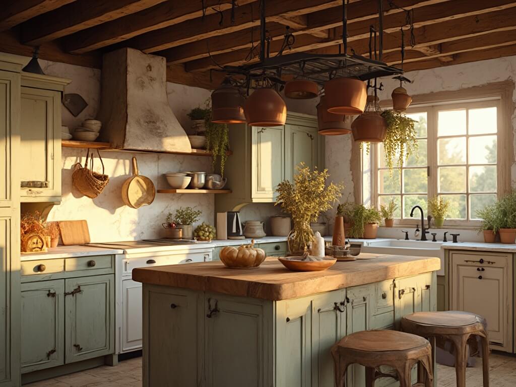
Farmhouse — traditional or modern — is a warm neutral base with a couple of grounded accents. Think creamy whites, greige, sage, navy, charcoal, and the occasional barn red on a pantry door. Not a stark all-white minimalist kitchen. Not a country kitchen with rooster wallpaper either.
This palette suits you if:
– You want a bright kitchen that still feels lived-in and cozy
– You have (or want) natural wood — oak shelves, butcher block, pine beams
– You like vintage pieces, open shelving, and a little imperfection
– You want a look that flexes with seasons through textiles instead of repainting
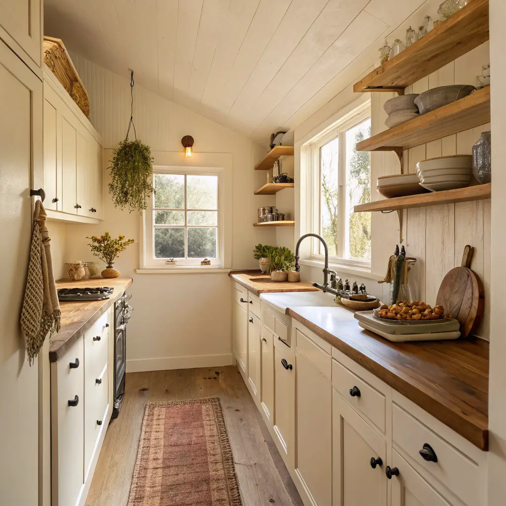
It works in a compact galley (where warm whites keep things bright), a standard family kitchen (perfect for two-tone cabinets), and open-plan spaces where the kitchen bleeds into a dining or living room.
What It Costs and How Long It Takes
Walls only, DIY: $150–$400 and 1–2 days including prep and dry time.
Walls + cabinets + island in an accent color, DIY: $300–$800 and 2–4 days for the cabinets alone. Cabinets take longer than you think — deglossing, priming, two coats, curing.
Rough breakdown:
– Wall paint (Sherwin-Williams, Benjamin Moore, Behr): $45–$75 per gallon, and you’ll need 2–3 gallons for an average kitchen
– Cabinet enamel (this matters — regular wall paint on cabinets is a mistake I made once): $60–$90 per gallon
– Supplies — rollers, angled brushes, tape, plastic sheeting, sanding sponges: $50–$120
Hiring it out: walls run about $2–$4 per square foot ($600–$1,200 for most kitchens). Walls plus cabinets is $2,000–$5,000+ depending on how many doors you have.
Skill-wise: walls are beginner-friendly. Cabinets are intermediate — the prep is the whole game. Two-tone color planning is intermediate too, mostly because it’s easy to pick two colors that fight each other.
The Whites Worth Your Time
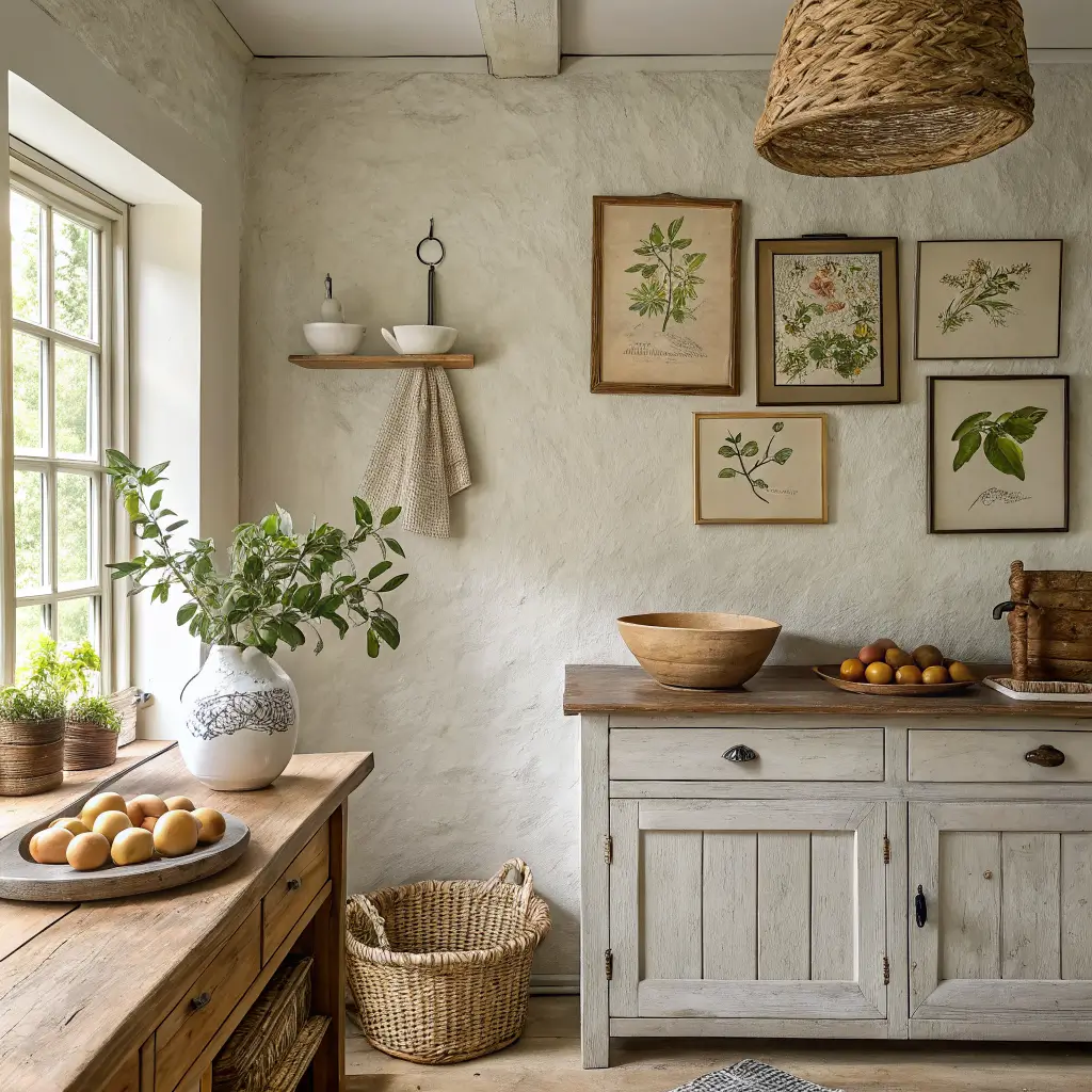
Farmhouse whites need to be warm. Cool blue-leaning whites turn clinical under LED bulbs and make butcher block look orange by contrast. Ask me how I know.
My short list, and when I’d use each:
– Benjamin Moore White Dove (OC-17) — soft off-white with a whisper of warmth. My default for both walls and trim if I want everything to blend. It’s forgiving under almost any light.
– Sherwin-Williams Alabaster (SW 7008) — creamy, slightly more yellow than White Dove. Best on cabinets when you have warm wood floors or brass hardware.
– Sherwin-Williams Extra White (SW 7006) — crisper. I use this for trim when the walls are greige and I want a clean line.
– PPG Commercial White (PPG1025-1) — a softer clean white if you don’t want a yellowy cast.
Skip anything labeled “pure white” or “decorator white” unless you love that gallery look. In a farmhouse kitchen it reads cold.
Greige, Taupe, and the Warm Neutrals
These are the workhorses. If you want color without committing to color, this is where you live.
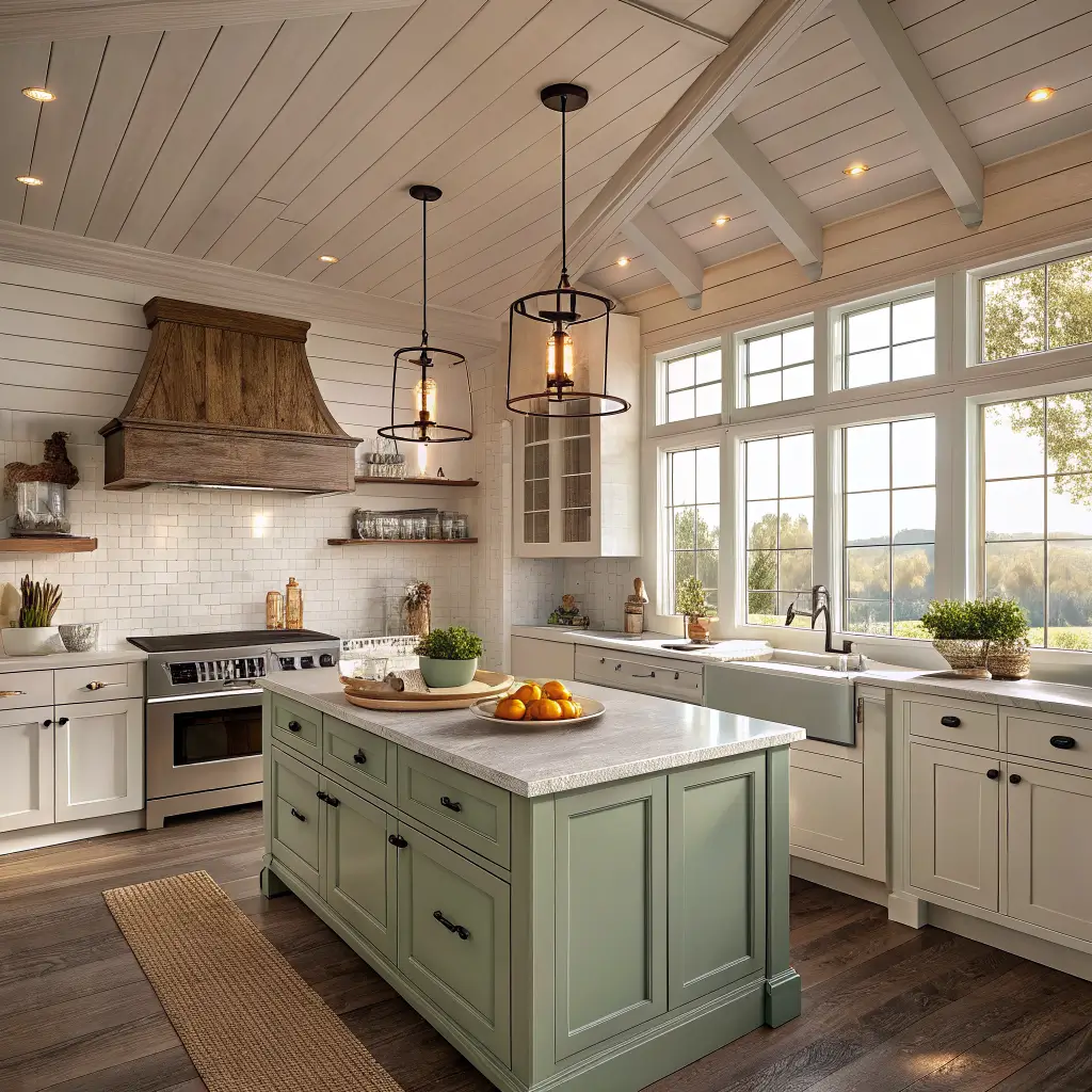
– Sherwin-Williams Agreeable Gray (SW 7029) — the greige that gets recommended for a reason. It bridges warm wood and cooler stone.
– Sherwin-Williams Accessible Beige (SW 7036) — earthier and browner. Beautiful with oak.
– Sherwin-Williams Repose Gray (SW 7015) — a truer gray with warm undertones. Good when your finishes lean cool.
For 2026 the whole farmhouse conversation is shifting toward what I’d call “dirtier” neutrals — muted mushrooms, warm taupes, sable browns. Less crisp gray, more grounded and earthy. If you’re repainting now, lean that direction. It ages better.
Farmhouse Greens (My Current Favorite)
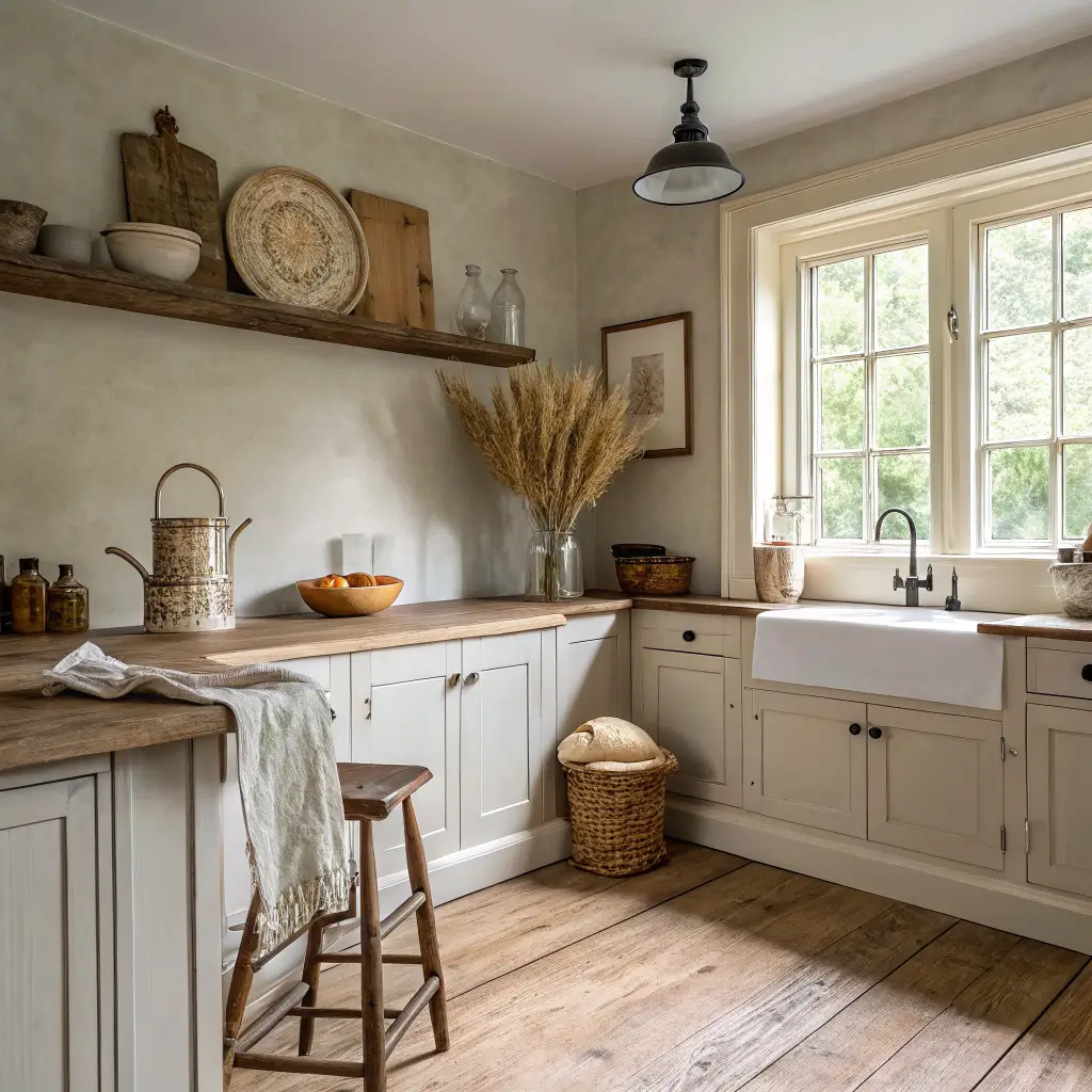
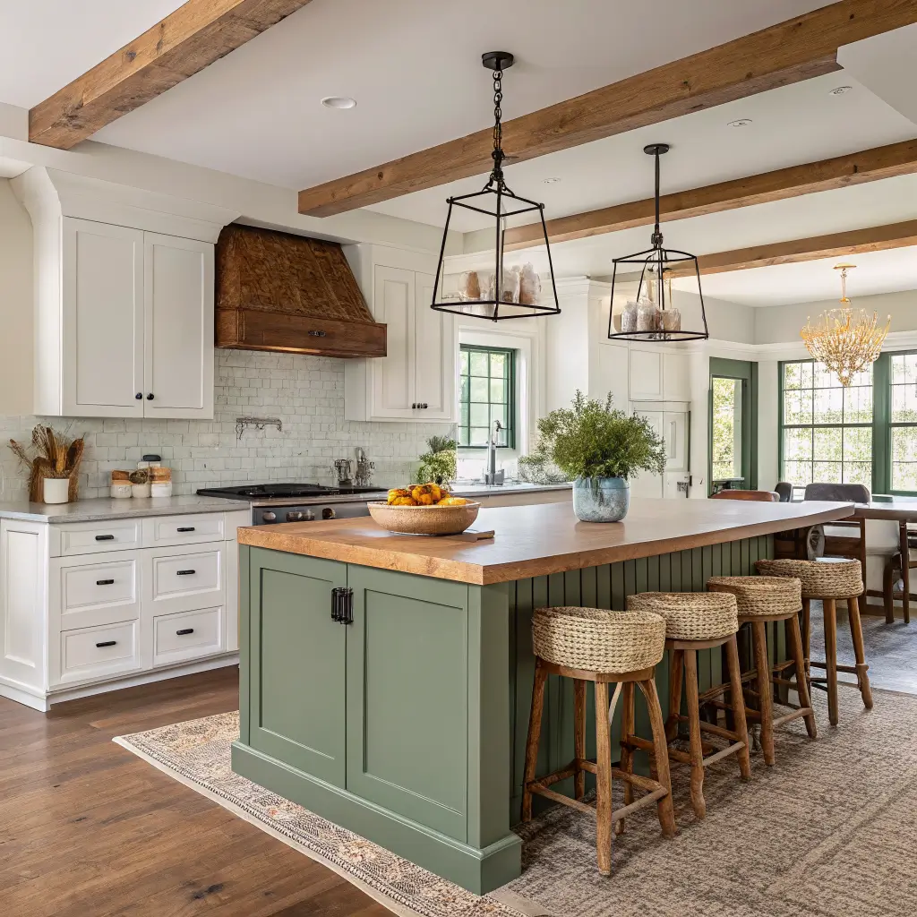
Sage and olive have quietly become the most-used farmhouse cabinet color, and I think for good reason — green plays well with wood, stone, brass, and white in a way that navy sometimes doesn’t.
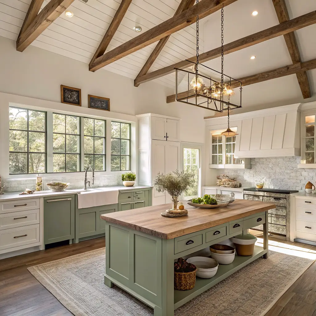
– Sherwin-Williams Clary Sage (SW 6178) — soft, dusty, cabinet-friendly. My pick for a lower cabinet or island if you want color that reads calm.
– Sherwin-Williams Dried Thyme (SW 6186) — a shade deeper and more muted. Good for a moodier kitchen.
– Sherwin-Williams Retreat (SW 6207) — the darkest of the three. This is what I painted my own island after living with a much brighter green (my first attempt, Behr Jojoba, was too yellow) for six months and hating it in evening light.
Pair any of these with butcher block or unlacquered brass and you’re basically done.
Farmhouse Blues
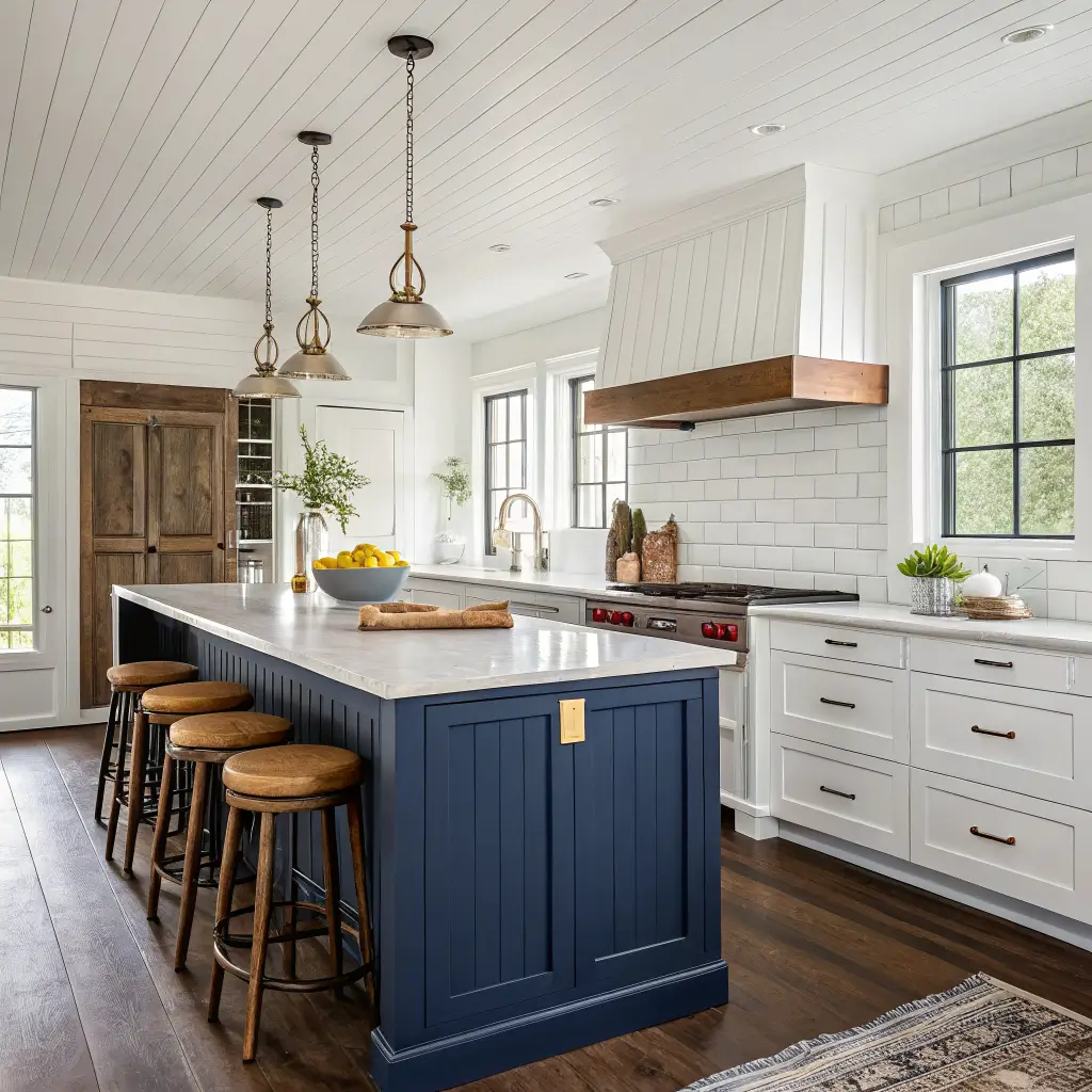
– Benjamin Moore Hale Navy (HC-154) — the classic navy island color. Reads black-blue in low light, softer in daylight.
– Sherwin-Williams Waterloo (SW 9141) — earthier, more gray in it. My preference over Hale Navy when the rest of the kitchen is warm.
– Behr Compass Blue (MQ5-54) — a genuinely dark navy (very low light reflectance) for people who want the drama.
Blacks, Charcoals, and Barn Red
– Sherwin-Williams Iron Ore (SW 7069) — soft black with warmth. My go-to for lower cabinets when I want dramatic-but-not-harsh.
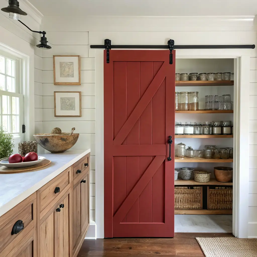
– Sherwin-Williams Tricorn Black (SW 6258) — true black. Use it on a range hood surround or a single pantry door, not on all your lowers unless you have serious natural light.
– Benjamin Moore Heritage Red (HC-181) — the barn red that isn’t cartoonish. Save it for a pantry door, mudroom door, or Dutch door.
How to Actually Put a Scheme Together
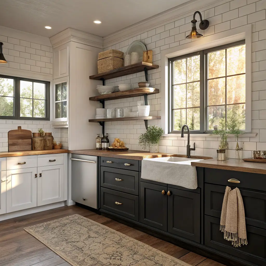
The rule I follow: 70–80% of your visible surfaces stay in light neutrals, 20–30% is your accent color. More than that and the kitchen starts to feel heavy.
A build order that works:
1. Walls first, in your foundation white or greige. White Dove, Alabaster, or Agreeable Gray are all safe.
2. Trim, window casings, and interior doors — same as walls for a soft, seamless look, or a crisper white (Extra White) for definition.
3. Upper cabinets in your light neutral. Match the walls if you want the kitchen to feel taller, or go one shade off.
4. Lower cabinets or island in your accent. This is where Clary Sage, Hale Navy, or Iron Ore earns its keep.
5. Hardware and lighting to tie it all together — matte black or oil-rubbed bronze for high contrast, unlacquered brass if you want warmth against green or navy.
Rule of thumb for two-tone: always put the darker color on the bottom. Dark uppers with light lowers feels backwards and top-heavy every single time.
Testing Paint (Do This, Don’t Skip It)
Buy sample pots. Paint 2-foot squares on at least three walls — one near the window, one far from it, one near your cabinets. Look at them at 8 a.m., 3 p.m., and 9 p.m. under whatever bulbs you actually use.
Greige is the biggest offender for pulling weird undertones. I’ve had Agreeable Gray go faintly purple in a north-facing kitchen with cool LEDs. Swapping the bulbs to 2700K warm white fixed it, but I would have caught it earlier if I’d tested properly.
Where to Spend, Where to Save
Spend on:
– Cabinet paint. Cheap cabinet paint chips, yellows, and shows every brush mark. Benjamin Moore Advance or Sherwin-Williams Emerald Urethane are both worth it.
– A good angled 2.5-inch brush. Purdy or Wooster. A $15 brush versus a $4 one is the difference between visible bristle marks and a smooth finish.
– Primer if you’re going over stained or glossy cabinets. Zinsser BIN shellac primer blocks tannin bleed from oak.
Save on:
– Wall paint. Behr Ultra or Valspar’s mid-tier lines are fine on walls. Nobody’s rubbing against your walls with greasy hands.
– Rollers, trays, tape. Buy the store brand.
– Sample colors from Samplize (peel-and-stick swatches) instead of buying eight sample pots.
Mistakes I See Constantly
Too many accent colors. Navy island, barn red door, mustard curtains, sage tea towels — pick one accent and one softer supporting accent, max. The rest is neutral.
Whites that are too cool. If your kitchen faces north or you have 5000K LED bulbs, ultra-crisp whites will look blue-gray. Go warmer than you think you need to.
Dark walls in a small, dim kitchen. I love a moody kitchen, but if you have one small window and 90 square feet, dark walls plus dark cabinets will feel like a cave. Keep walls and uppers light. Put the drama on the island.
Trim that fights the walls. Painting Alabaster walls with a bright white trim creates a chalky line that looks unfinished. Either match, or go one clear step crisper (Extra White with Alabaster walls works).
Skipping the degreaser. Kitchen walls and cabinets have a film of cooking oil on them whether you can see it or not. Paint will not stick. Use Krud Kutter or a TSP substitute before you sand.
Easy Updates Without Repainting
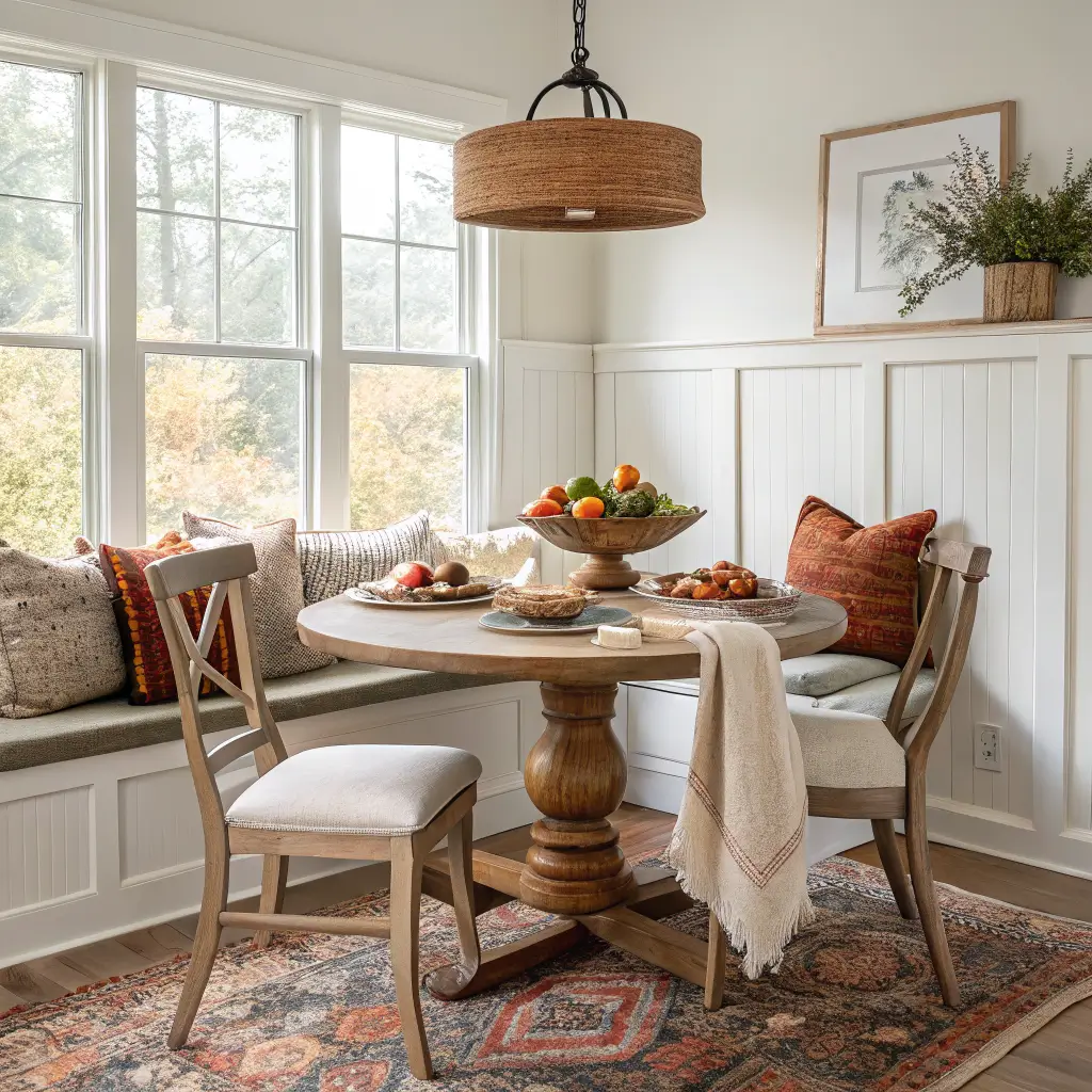
Once the paint is done, seasonal shifts are all textiles and accents:
– Spring: butter yellow tea towels, pale green ceramics, a jar of eucalyptus
– Fall: rust and terracotta runners, wooden cutting boards out on display, deep green squash on the counter
– Winter: black candlesticks, charcoal linen, a bowl of citrus
If you want a bigger refresh without repainting the whole kitchen:
– Paint just the island (one quart, $20–$35)
– Paint one interior door in an accent color ($30–$60 total)
– Swap hardware to change the whole feel — matte black pulls to unlacquered brass will make navy cabinets read completely different
Answers to the Questions Everyone Asks
Best white for a farmhouse kitchen? Benjamin Moore White Dove for a soft, forgiving warm white. Sherwin-Williams Alabaster if you want something slightly creamier on cabinets.
Are gray cabinets still in style? Warm gray and greige, yes. Cool blue-gray reads dated now. If you have cool gray cabinets you don’t want to repaint, warm them up with brass hardware and wood accents.
What goes with natural wood? Warm whites, greige, sage green, and navy. Avoid pink-based beiges — they clash with almost every wood tone.
Can I do black cabinets without it feeling too modern? Yes, if you soften with wood, unlacquered brass, and warm white walls. Iron Ore reads farmhouse. Tricorn Black on every lower cabinet reads restaurant.
Best two-tone combo if I want a safe bet? White Dove uppers with Clary Sage lowers, brass hardware, butcher block counters, white subway backsplash. It’s not novel, but it works in almost any light and any house.
Pick your white first. Get the undertone right. Then commit to one accent — sage, navy, or charcoal — and let everything else stay quiet. That’s the whole formula.