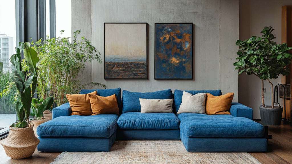
The Look: Warm Minimalism, Not Cold Minimalism
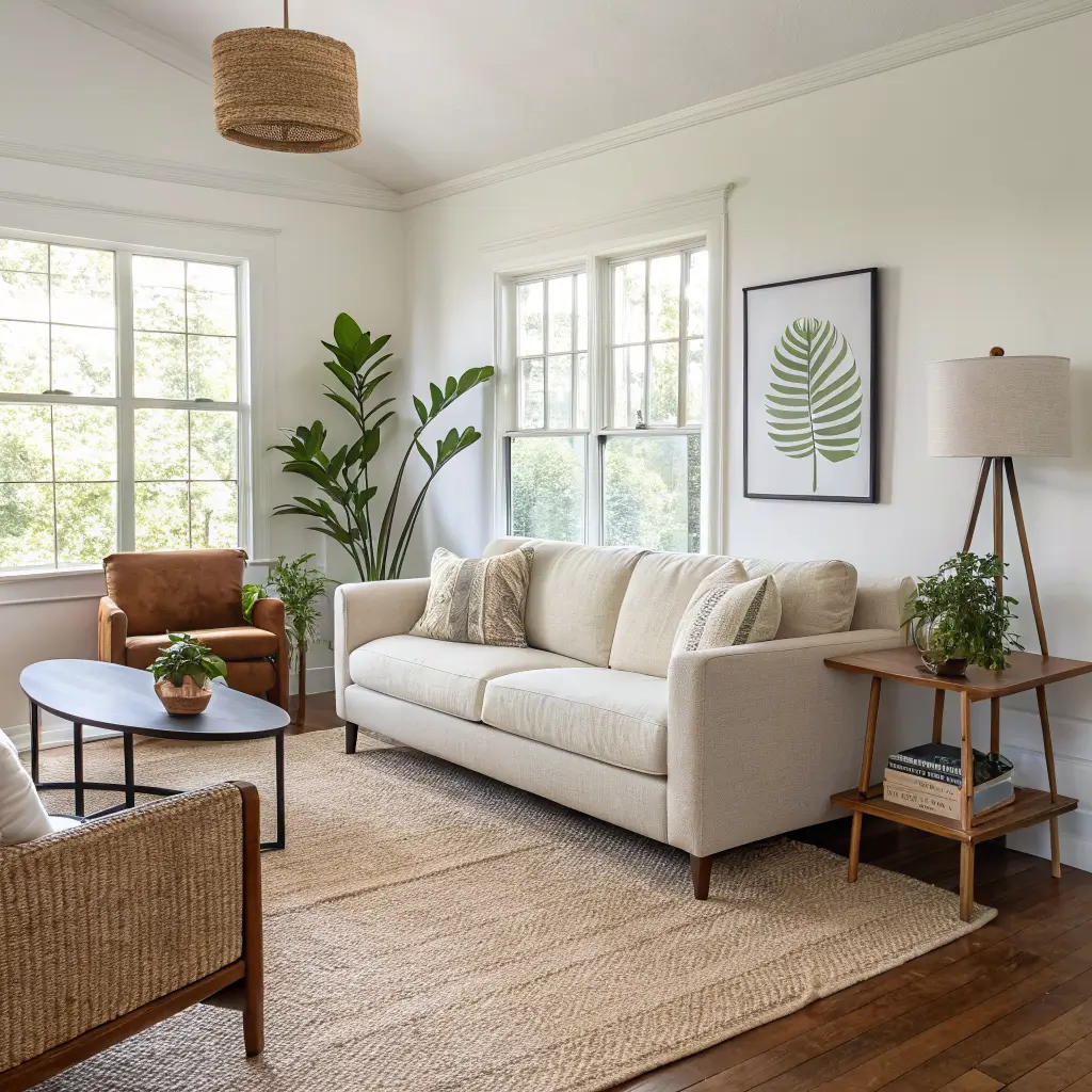
The minimalist decor with a personal touch is the line I keep landing on. I cleared the surfaces but left the one photo that means something, and the room stayed warm.
Think of the style as cozy minimalism or warm minimalism — the Scandi-adjacent version where you keep the clean lines and negative space (the empty areas around objects that let your eye rest), but you soften everything with wood, linen, warm bulbs, and a few things that mean something to you.
It suits:
– Renters and small-space dwellers who need calm and function
– People who hate clutter but also hate hotel-lobby energy
– Families who want to display kids’ art without the fridge-door explosion
– Anyone with heirlooms, travel bits, or a photo habit they want to honor
It works especially well in rooms roughly 10’×12′ to 12’×16′ — bedrooms, living rooms, small open-plan spaces where every object gets noticed.
Time, Cost, and Skill
Time: A single room takes me 4–8 hours if I’m doing it in one push — decluttering, moving furniture, styling, hanging a couple of frames. A whole small apartment is a weekend, honestly two if you’re sourcing pieces.
Skill level: Beginner to intermediate. If you can hang a frame straight and resist buying the third throw pillow, you’re qualified.
Budget bands, roughly:
– Refresh using what you own: $150–$400 per room. Frames ($5–$20 at IKEA or Target), a couple of linen pillow covers ($20–$60), one good plant ($20–$80).
– Mid-range redo: $1,500–$3,000 for a living room. Clean-lined sofa ($700–$1,500), low-profile coffee table ($150–$600), one big art piece ($150–$500), 8’×10′ wool or jute rug ($250–$800).
– Higher-end with artisan touches: $3,000–$7,000+. Handmade ceramics ($40–$200 each), custom-framed personal photos ($40–$150 per frame), a sculptural pendant ($400–$1,200).
The mistake I made in my first place: I spent almost the whole budget on a sofa and had nothing left for lighting. Bad ceiling light kills a minimalist room faster than clutter does.
The Palette and Materials
Keep the big surfaces quiet and let personal pieces do the talking.
Base neutrals I actually use and trust:
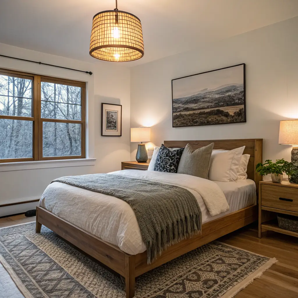
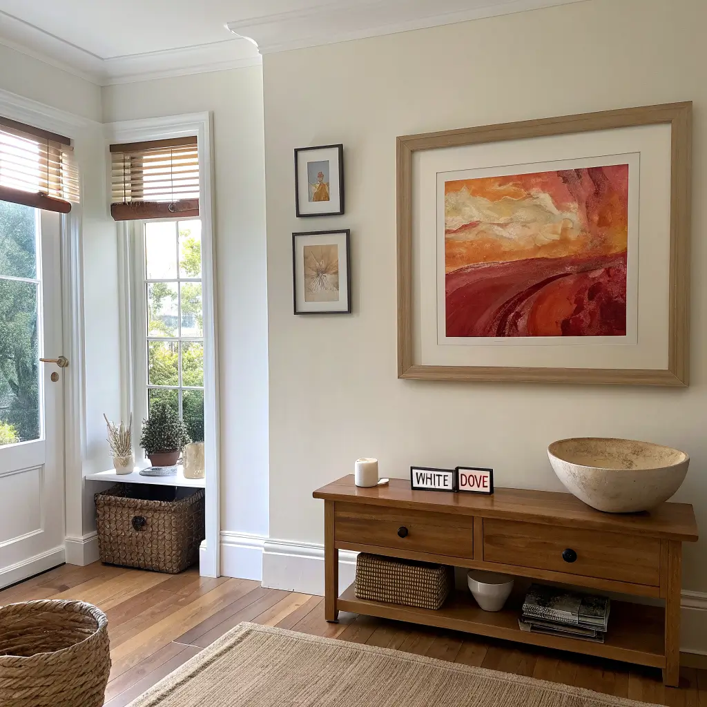
– Warm white walls (Benjamin Moore White Dove is the safest bet — cream-leaning, not blue)
– Soft beige, sand, light greige for upholstery and rugs
– Muted taupe or warm gray for a second larger piece
Accent colors — pick one or two, not five:
– Desaturated blue, olive or forest green, muted terracotta, or a rust
– Whatever you choose, repeat it 3–5 times around the room: a pillow, a book spine, a small vase, a piece of art. That repetition is what makes a space feel intentional instead of accidental.
Materials to layer:
– Wood: oak, ash, or birch as the primary; walnut for warmth in small doses
– Textiles: linen, cotton, wool, boucle, jute, a bit of velvet
– Metals: matte black or brushed brass — pick one and stay consistent for hardware and lamps
– Stone and ceramic: a marble tray, a concrete planter, one handmade bowl
– Organic: live plants, dried branches, a bowl of stones from somewhere real
The Hero Pieces
Every room needs a small number of things doing the heavy lifting.
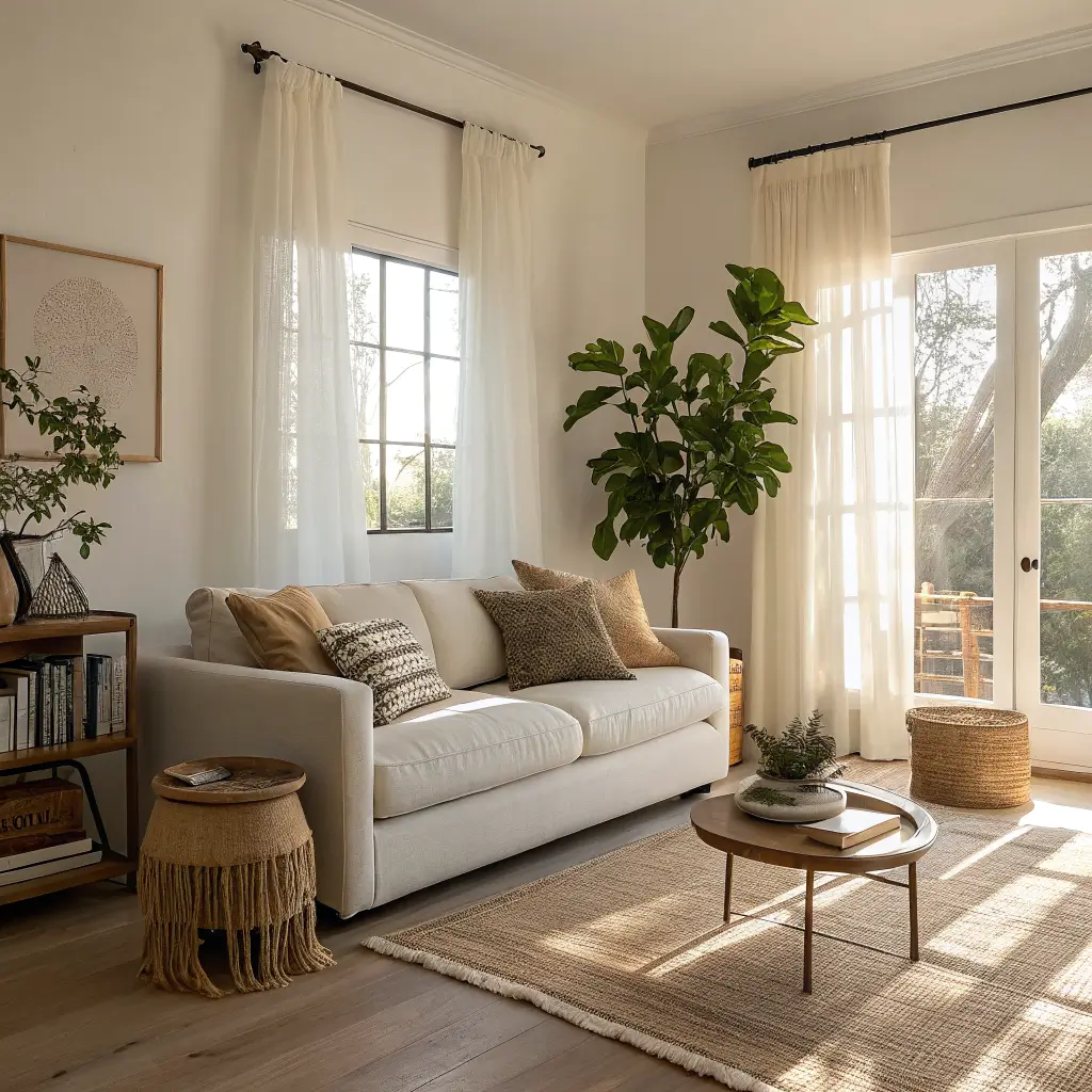
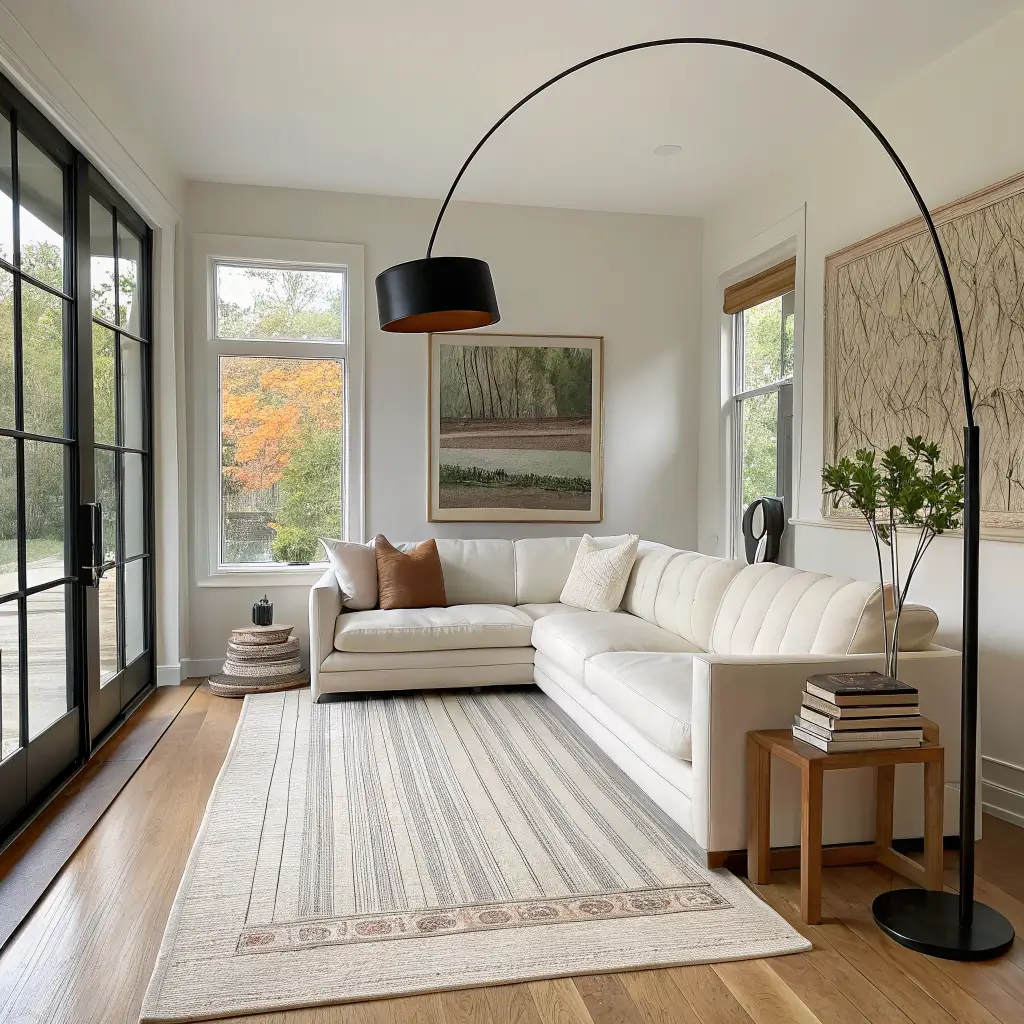
– A clean-lined sofa in linen or cotton, 78"–90", in warm white, oatmeal, or soft gray
– One statement rug anchoring the seating zone (front legs of the sofa on the rug, minimum)
– One oversized piece of art or a single large photograph above the sofa or bed — this is where your story goes
– A sculptural light — pendant, floor lamp, or arc lamp — that reads as functional art
That’s it. Four pieces. If those four are right, the room is 80% there before you style a single shelf.
The Personal Touch: What Actually Belongs on Display
This is where most people either overdo it or chicken out. The trick is to give sentimental items specific real estate instead of letting them spread everywhere.
Pick one zone per room for personal stuff:
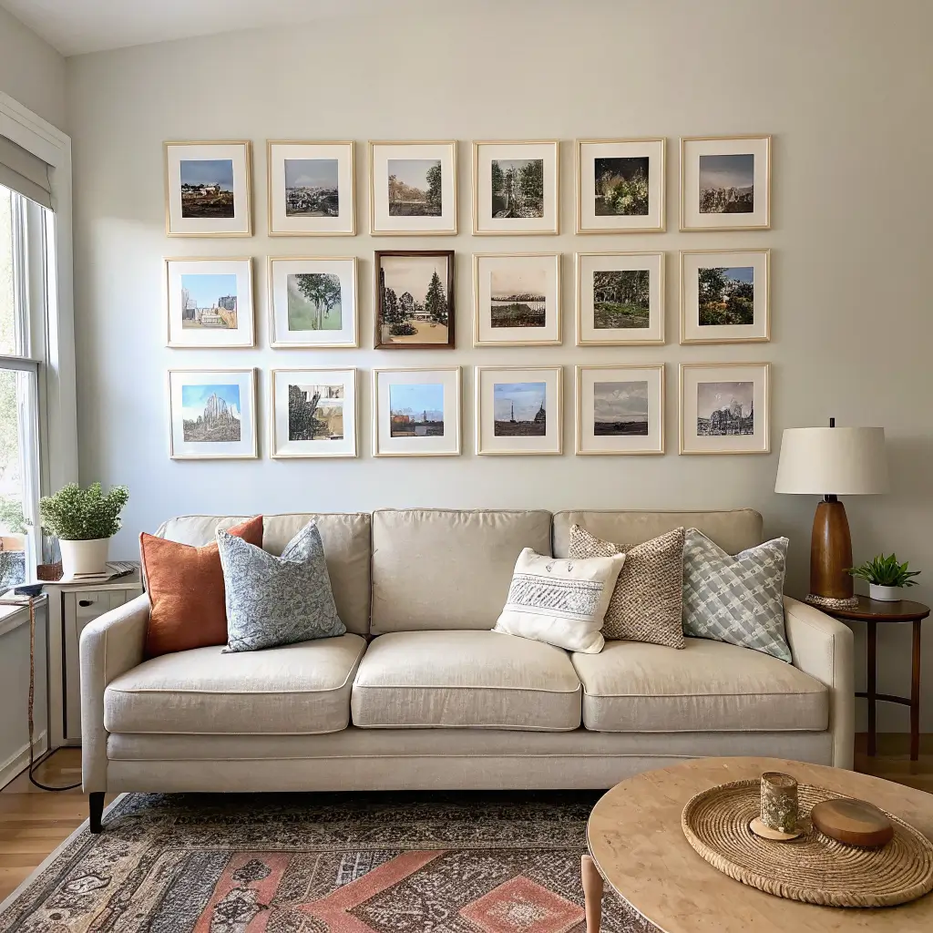
– A gallery wall — planned, not accreted over time
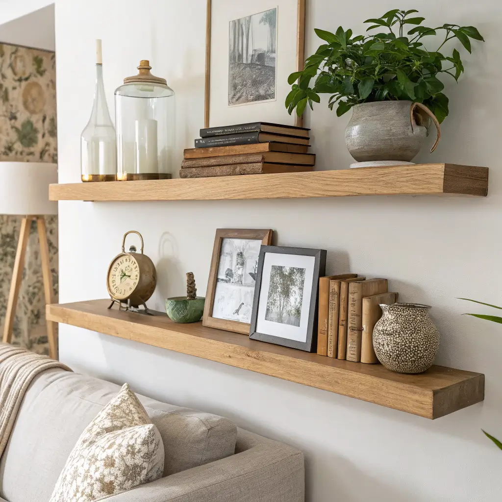
– One styled shelf or ledge
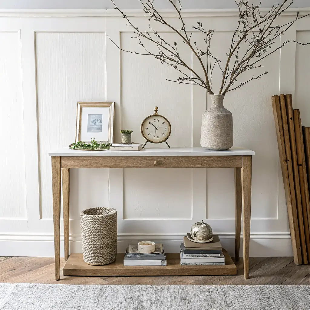
– One console vignette
The rest of the surfaces stay mostly clear.
What earns a spot:
– Framed personal photography — travel, family, landscape shots, kept to a cohesive palette (either all black-and-white or all warm-toned)
– Kids’ art, but curated: one large frame with a rotating piece, or a tidy grid of matching frames
– Heirlooms — my grandfather’s brass desk clock lives on my bookshelf and it’s worth more to the room than anything I’ve bought new
– Coffee table books stacked in twos or threes, spines pointing the same way, with covers that share a palette
– Textiles with a story — a Turkish kilim pillow, a wool throw from a market, a hand-knit blanket
What doesn’t earn a spot: mass-market prints with generic quotes, souvenir shop knickknacks with no memory attached, decor bought only because it "matched."
How to Actually Put It Together
Step 1: Empty the room, or at least clear every surface. You can’t style over clutter. Take everything off, then only put back what has a real reason.
Step 2: Float the furniture. Do not push everything against the walls. A sofa 12"–18" off a wall with a slim console behind it looks intentional. Two chairs angled toward a sofa creates a conversation zone even in a small space.
Step 3: Lay the rug. Big enough that at least the front two furniture legs sit on it. Undersized rugs are the number-one thing that makes a room feel wrong for reasons people can’t name.
Step 4: Light it in layers. One ceiling source, at least two lower sources (a table lamp and a floor lamp). Warm bulbs, 2700K or lower. Not 4000K. Not "daylight." Ever.
Step 5: Add textiles. Two to four pillows on a sofa, mixed textures (a linen, a boucle, one with subtle pattern), one throw draped — not folded like a hotel.
Step 6: Bring in one big plant. A 4-to-6-foot fiddle leaf, rubber plant, or olive tree in a neutral pot, placed in the awkward empty corner past the sofa. This single move fixes more rooms than any wall art.
Step 7: Style your one personal zone. Groups of 3 or 5. Vary the heights — tall, medium, low. Test wall layouts with painter’s tape before you drill.
Common Mistakes I’ve Made So You Don’t Have To
Every surface hosting a small "moment." I did this early — a tray here, a candle there, a stack of postcards, a little bowl of matches. It reads as clutter no matter how tasteful each item is. Fix: pick your zones, leave the rest bare.
Buying decor with zero personal meaning. A styled room without any of you in it looks like an Airbnb. Fix: before buying anything decorative, ask if it either does a job or tells a story. If neither, skip it.
All-white everything. I tried this in a north-facing apartment and it felt like a dentist’s office. Fix: bring in wood tones, a jute or wool rug, and warm bulbs — the temperature of the room shifts immediately.
Colors from random sources fighting each other. A red book, a blue pillow, a green vase, a yellow candle. Fix: unify frames (all oak, all black, or all white), and if you’re keeping mismatched sentimental items, group them so they read as a collection instead of leftovers.
A gallery wall that grew instead of being planned. Different frame colors, random sizes, uneven gaps. Fix: lay it all out on the floor first, cut paper templates, tape them to the wall, live with the layout for a day before nailing anything. Consistent frame color does 90% of the work.
Displaying Sentimental Stuff Without the Clutter
The rule I actually follow: one in, one out. New framed photo goes up? Something old comes down and gets stored. I keep a small bin in the closet with rotating pieces — off-season art, extra ceramics, a couple of vintage books. Every few months I swap something.
For kids’ art specifically: one big frame with a mat that fits standard 9"×12" paper, changed monthly. The old ones go in a labeled folio. This solved a two-year argument in my house.
Seasonal Swaps That Aren’t Corny
Keep the furniture and rugs static. Swap the small stuff.
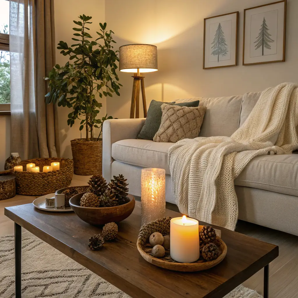
– Winter: wool throw, chunky knit pillow covers, unscented pillar candles, a bowl of pinecones or citrus
– Spring: linen pillow covers in a softer tone, branches (cherry, forsythia) in a tall vase
– Summer: lighter cotton throws, a bowl of shells or stones from an actual trip, one botanical print swapped into the gallery wall
– Fall: dried grasses, one deeper accent color (rust, olive) in a pillow, warmer lamp temperature
No pumpkins with faces. No inflatable anything.
Cross-Style Variations
If straight warm minimalism feels too plain for you, bend it slightly:
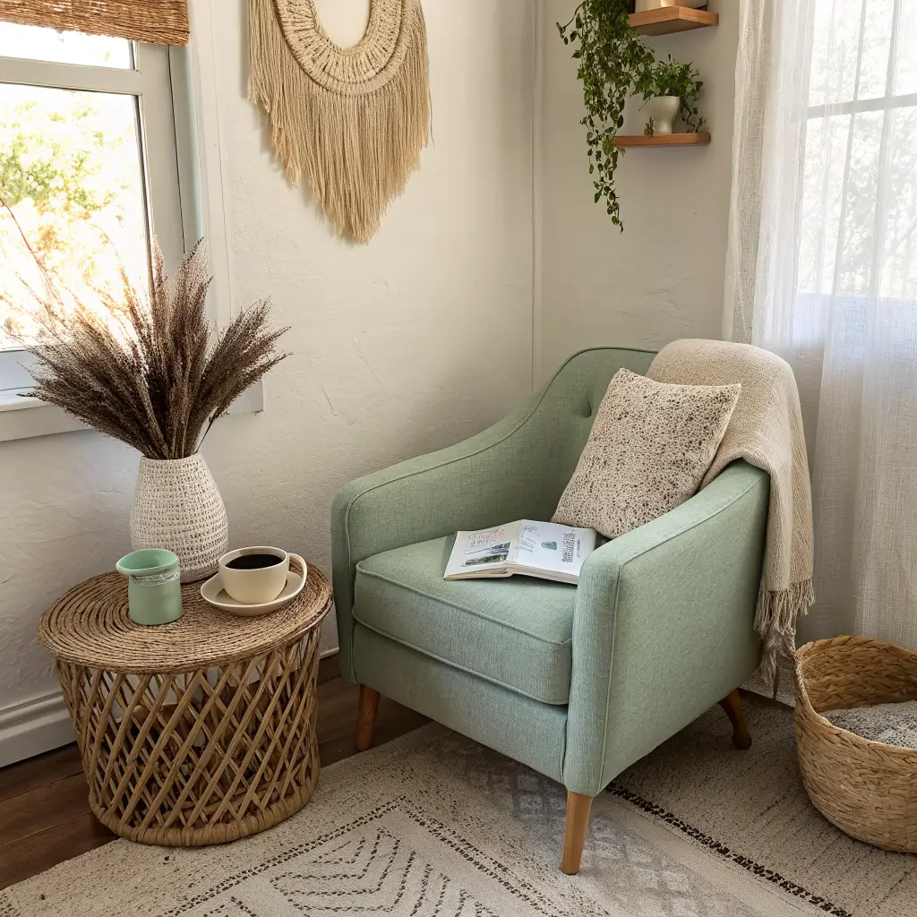
– Minimalist × boho: one textured wall hanging, woven baskets used as real storage, earth-tone textiles — but keep surfaces edited
– Minimalist × coastal: soft blues, one striped pillow, light oak, driftwood or shells in a single vignette (not scattered across the room)
– Minimalist × modern classic: brass hardware, one traditional framed piece, heirloom wood furniture used as anchors instead of accents
The through-line is restraint. You’re borrowing a note from another style, not switching genres.
Where to Spend, Where to Save
Spend on:
– The sofa (you sit on it every day)
– Lighting (cheap lamps ruin expensive rooms)
– The rug (undersized or synthetic ones look cheap fast)
– Custom framing for the pieces that matter most
Save on:
– Frames for rotating art — IKEA Ribba and Hovsta are honestly fine
– Pillow covers (change these cheaply and often)
– Plants (start small, they grow)
– Coffee table books — thrift stores and library sales
The couch I bought for $2,200 five years ago still looks great. The $89 lamp I bought to "save money" I’ve replaced twice. Lesson learned.
The version of this style that works long-term isn’t the one you copy from a photo. It’s the one where a stranger could walk into your living room and, from three or four objects, get a real sense of who lives there — and still feel like they can exhale.