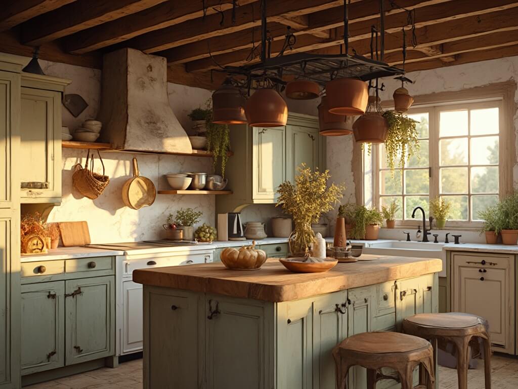
Why Taupe Kitchen Cabinets Are a Game-Changer
We chose taupe cabinets as a step between grey and brown, and the kitchen felt soft instead of cold. Taupe kitchen cabinets pair with most counters and read as calm.
What Exactly is Taupe?
Think of taupe as the love child of beige and gray, with a hint of sophistication. It’s that magical color that slides between warm and cool tones, making every kitchen feel like a designer’s dream.

Killer Benefits of Taupe Cabinets
- Timeless Elegance: Unlike trendy colors that scream “2010 called,” taupe whispers classic sophistication
- Design Flexibility: From farmhouse to modern minimalist, taupe adapts like a design ninja
- Mood Magic: Creates a calm, welcoming atmosphere that makes your kitchen feel like home
- Trend-Proof: Will look amazing five, ten, even fifteen years from now

🌟 Steal This Look
- Paint Color: Sherwin-Williams Accessible Beige SW 7036
- Furniture: warm white oak kitchen island with waterfall edge, matte black bar stools with woven leather seats, open shelving in natural walnut
- Lighting: brass linear pendant lights with frosted glass globes over island, under-cabinet LED strip lighting in warm 2700K
- Materials: honed Carrara marble countertops, brushed brass cabinet hardware, hand-zellige tile backsplash in warm white, natural linen window treatments
I’ve watched taupe transform kitchens from builder-basic to bespoke—the way it catches afternoon light feels like the room itself is exhaling, creating that lived-in elegance clients spend years trying to achieve.
Taupe Cabinet Personality Types
Light Taupe: The Fresh Start
Imagine a kitchen that feels like a warm hug from a cream-colored cloud. Light taupe brings brightness without the sterility of pure white.
Perfect Pairings:
- Crisp white countertops
- Stainless steel appliances
- Natural wood accents

Medium Taupe: The Goldilocks Zone
Not too light, not too dark – medium taupe is just right. It adds depth without making your kitchen feel like a cave.
Design Wow Factors:
- Marble countertops
- Brass hardware
- Subtle texture variations

Dark Taupe: The Drama Queen
For those who want their kitchen to make a statement without screaming for attention.
Bold Combinations:
- Light countertops
- Dramatic backsplashes
- Industrial-style lighting

🌟 Steal This Look
- Paint Color: Benjamin Moore Revere Pewter HC-172
- Furniture: Shaker-style taupe base cabinets with matching uppers, waterfall-edge island in light oak, open shelving with natural wood brackets
- Lighting: Matte black pendant lights with exposed Edison bulbs over island, under-cabinet LED strip lighting
- Materials: Honed Carrara marble countertops, brushed brass cabinet pulls and knobs, white oak floating shelves, textured ceramic subway tile backsplash
I’ve watched taupe cabinets completely transform kitchens that felt too cold with gray or too expected with white—it has this uncanny ability to feel both timeless and quietly luxurious without trying too hard.
Top Taupe Paint Colors Designers Swear By
- Perfect Greige
- Warm and cozy
- Medium-dark range
- Designer’s secret weapon
- Agreeable Gray by Sherwin Williams
- Versatility personified
- Minimal undertones
- Works in almost any space
- Modern Gray by Sherwin Williams
- Soft and subtle
- Adds warmth effortlessly
- Perfect for hesitant decorators

★ Steal This Look
- Paint Color: Farrow & Ball Mouse’s Back 40
- Furniture: taupe-stained oak kitchen island with clean shaker cabinet doors, brushed brass bar stools with leather seats
- Lighting: oversized linen drum pendants in warm white over the island, under-cabinet LED strips in 2700K
- Materials: honed Carrara marble countertops, unlacquered brass hardware, white oak floating shelves, textured ceramic backsplash in warm gray
I’ve watched homeowners fall hard for ‘Perfect Greige’ only to realize their fluorescent overheads turned it institutional beige—always factor in your kitchen’s natural light before committing.
Pro Tips for Styling Taupe Cabinets
Color Harmony Strategies
- Layer neutrals like a pro
- Introduce strategic pops of color
- Mix textures for visual interest
Material Matchmaking
- Marble countertops = instant elegance
- Wooden elements = warmth
- Metallic hardware = modern edge

✎ Steal This Look
- Paint Color: Behr Wheat Bread 720C-3
- Furniture: Walnut bar stools with woven rush seats, matte black metal frame console for coffee station, open oak shelving with black brackets
- Lighting: Brushed brass pendant lights with clear glass globes, 10-12 inch diameter, hung 30-36 inches above island
- Materials: Honed Calacatta marble countertops, white oak floating shelves, antique brass cabinet pulls and knobs, textured linen Roman shades, terracotta ceramic vases
Taupe cabinets feel like that perfectly broken-in leather chair—neutral enough to live with forever, warm enough to actually welcome you home. The trick is treating them as your quiet foundation and letting everything else sing.
The Quiet Luxury of Taupe
Taupe kitchen cabinets aren’t just a color choice – they’re a lifestyle statement. They whisper sophistication while allowing your personal style to shine.
Pro Decorator Insight: Taupe is the ultimate design chameleon. It doesn’t compete; it complements.
Final Thought
Choosing taupe kitchen cabinets isn’t just a design decision. It’s giving your kitchen a passport to timeless, effortless style.
Ready to transform your kitchen? Taupe is waiting.
💡 Steal This Look
- Paint Color: Valspar Simply Taupe 6002-1B
- Furniture: warm white oak kitchen island with waterfall edge, brushed brass bar stools with leather seats, open shelving in natural walnut
- Lighting: linear LED pendant in aged brass with frosted glass diffusers over island, under-cabinet LED strip lighting
- Materials: honed Calacatta Viola marble backsplash, unlacquered brass hardware, wire-brushed white oak flooring, linen window treatments
I’ve watched taupe transform kitchens from forgettable to editorial—the secret is treating it as a warm neutral that deserves rich, tactile companions like raw brass and living marble.
Final Thoughts
Taupe kitchen cabinets pair with most counters and read as calm. Keep the walls light and the room stays soft, not cold.